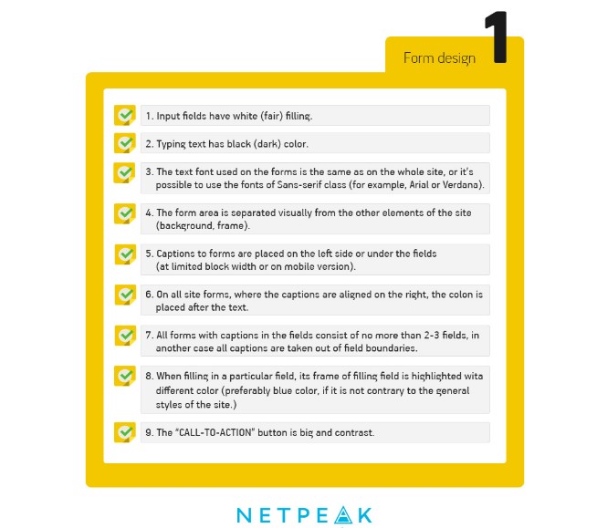
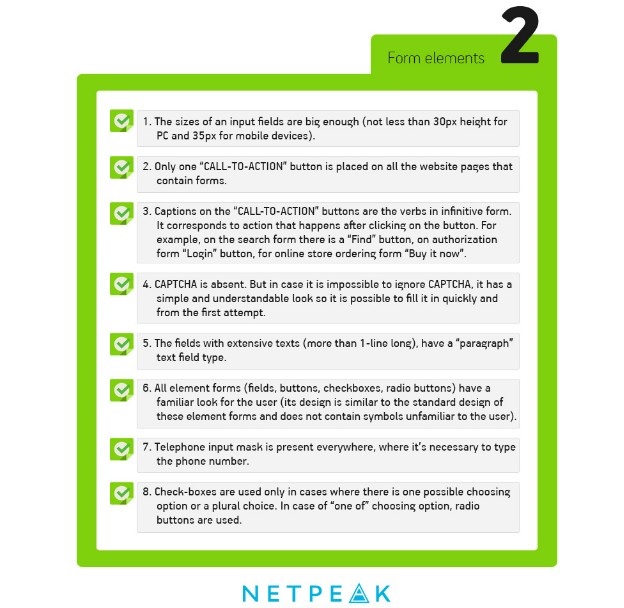
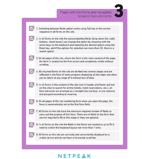
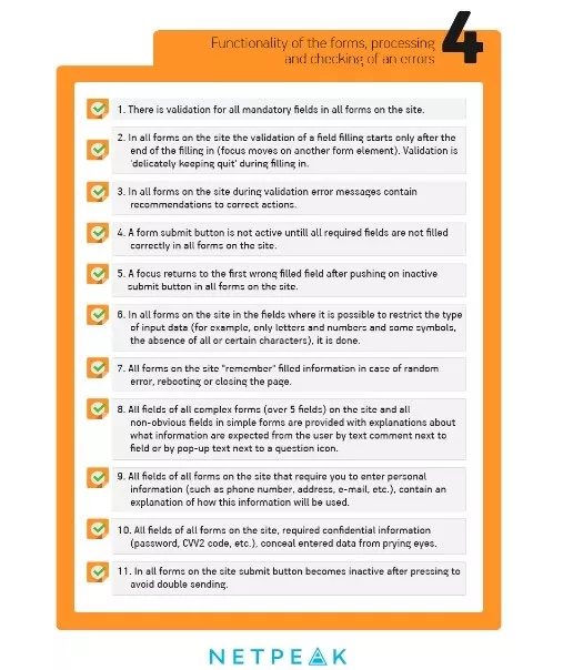
One of the key marketing problems all online stores try to cope with is that about 70-80% of all users usually leave website at the stage of making an order. The majority of mistakes in the ordering forms are extremely trivial, and we have already given some precise advice on how to prevent it. However, every day we see the order website forms that consist of many fields and look really boring. Because of that we decided to show the detailed checklist for every type of order forms for E-commerce sites. You can show this post to all the design and usability rules violators.
In the “Western world” countries, the issue of the design culture form development was solved with help of contests, such as Web Form Design Awards and Ecommerce Design Awards by Shopify. Not only the best participants can take top places. For example, this project was recognized as one of the ugliest Ecommerce sites in UK. Unfortunately, such voting systems are not presented in our country.
One of the top usability specialists Christian Holst recommends to avoid such buttons as “Next”, “Preview” and especially – “Confirm” (if it refers to the confirmation of sending the forms’ data) when creating a form. More than 50% of participants of Holst experiment haven't even thought about pressing the button in case there is a second CTA on the site page.
Specialists don’t recommend to add a separate field with the button for promo code input (gift coupon). The great number of users like to “google” promo code and don’t come back no more on the site. So it’s easier just to show the question ( “Do you have gift coupon?”) with active link and pop-up input field.
The checklist version without editorial comments is presented on our Pinterest page. Besides thinking about quality design of order forms itis also necessary to think about quality setup of advertising campaign for attraction of potential customers. Do you want to spend money with benefits? Read step-by-step instruction on set-up of contextual advertising.

 2
2
 0
0
 2
2
Related Articles
How to Set Up Consent Mode in GA4 on Your Website with Google Tag Manager
Let's explore how to properly integrate consent mode in GA4, configure it for effective data collection, and at the same time comply with GDPR and other legal regulations
Display Advertising Effectiveness Analysis: A Comprehensive Approach to Measuring Its Impact
In this article, I will explain why you shouldn’t underestimate display advertising and how to analyze its impact using Google Analytics 4
Generative Engine Optimization: What Businesses Get From Ranking in SearchGPT
Companies that master SearchGPT SEO and generative engine optimization will capture high-intent traffic from users seeking direct, authoritative answers