Google Analytics allows you to create unique custom reports to obtain and consolidate all crucial information about your business. This can significantly speed up the decision-making process. In Universal Analytics, we used Settings → Custom Reports for this purpose. Everything has changed in Google Analytics 4. This article explains how to create custom reports in GA 4 using the free form reports in the Exploration tool.
Custom reports in Google Analytics 4
To get started, log in to your Google Analytics 4 account and click Explore on the left sidebar.
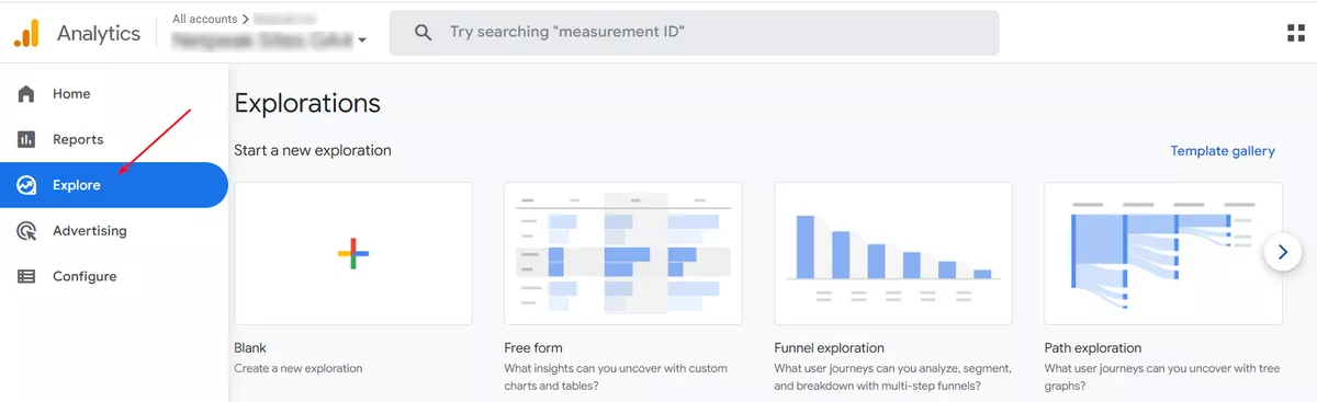
This section contains different report templates to choose from.
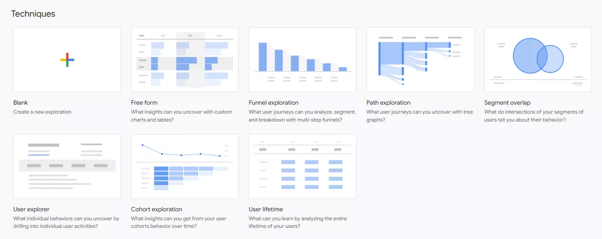
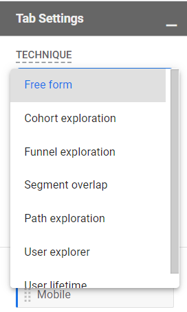
- Free form. Creating this type of report is as effortless as possible, and almost all available segments, parameters, and indicators can be conveniently combined. The data can be presented in various forms (tables, bar graphs, charts). Keep reading this post to learn more about free form reports.
- Funnel exploration. Use funnel exploration reports to track and visualize the steps your customers take before completing a conversion and quickly identify if they go through each stage successfully.
- Path exploration. Here, a tree diagram represents the sequence of events, user-initiated events, and screens they viewed.
- Segment overlap. This type of report allows you to compare up to three different user segments and see how they relate to each other. You can then identify groups of users who meet a complex set of conditions. Based on this, you can create new segments and use them with other methods in the Exploration tool and in other Google Analytics reports.
- User explorer. In a user explorer study, you can select a specific group of visitors to view detailed statistics on the actions of each user from that group. This is useful when you need to personalize interactions with users and better understand the sequence of transitions.
- Cohort exploration. A cohort is a group of users who exhibit a common characteristic, which in this report is a specific action taken by the user.
- User lifetime. With this type of report, you can analyze user actions and transactions for the entire period they use your website or app.
Free form reports in Google Analytics 4
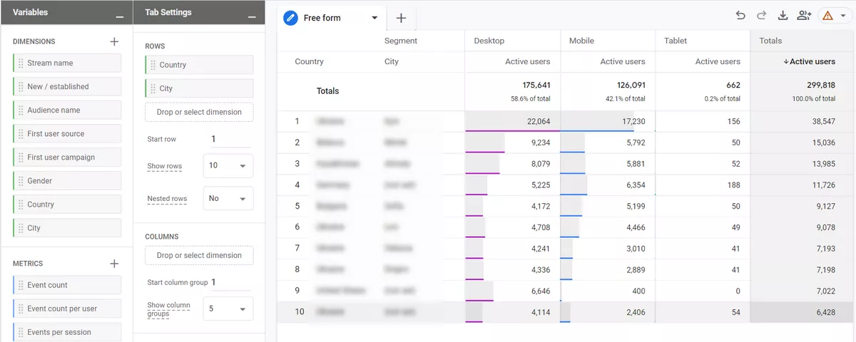
Now, let's take a closer look at the components of the free form interface. It is split into three main parts:
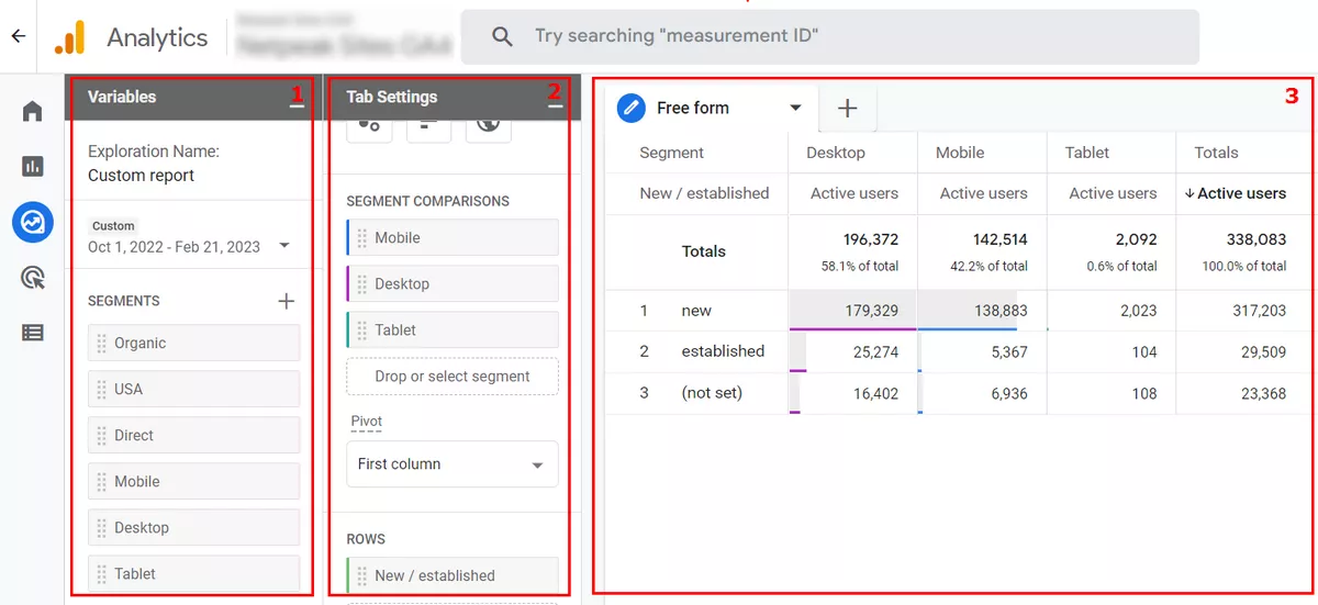
- Variables: segments, dimensions, and metrics that can be used in a custom report.
- Tab settings: data used in the report.
- Output: the report created based on your configuration.
The best way to explain the different components of a custom report in GA 4 is to show you how to create a free form study.
Variables
To begin, select the data that you want to include in the report:
- date range
- segments
- dimensions
- metrics
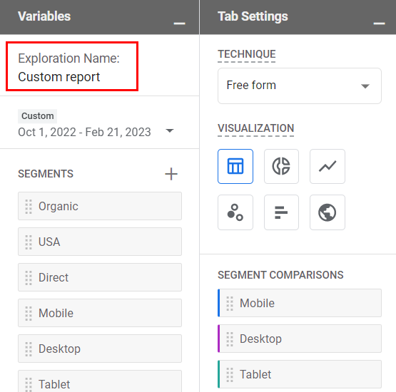
You can change the name of the analysis in the top-left corner of the interface.
To select a different date range, click on the date in the top-left corner (below the exploration name) and select the range you need (e.g., last 7 days, last 30 days).
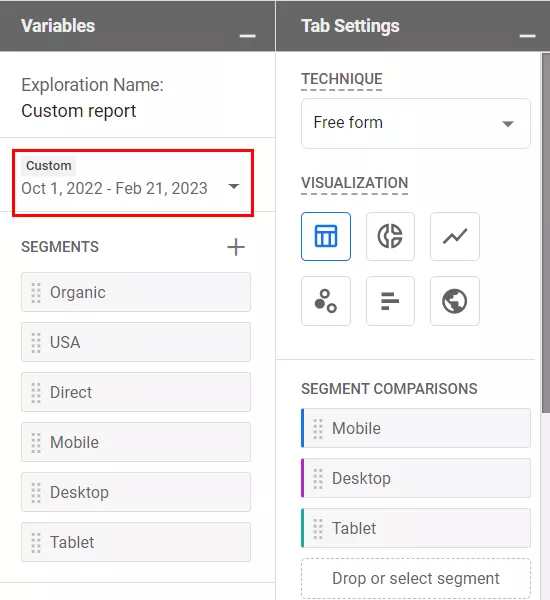
If you want to compare how different groups of users or visitors are behaving, be sure to include those segments in the Segments section first. To do so, click on the Plus icon:
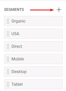
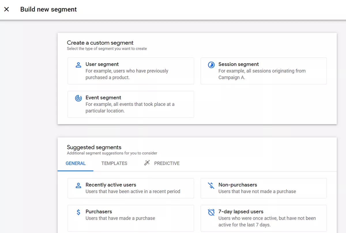
Then, you can either create a custom segment or select a suggested one.
Dimensions and metrics
In Google Analytics, dimensions are parameters or attributes of an event, product, transaction, or user. Essentially, they are attributes that describe an entity. For example, event names, transaction IDs, user pricing plans, and product categories.
Metrics help us measure performance. Metrics can include the number of events that occurred yesterday, the volume of transactions completed last week, the conversion rate last month, and so on.
Here are some examples of actual metric names in GA4:
- event count
- number of active users
- number of transactions
- engagement rate
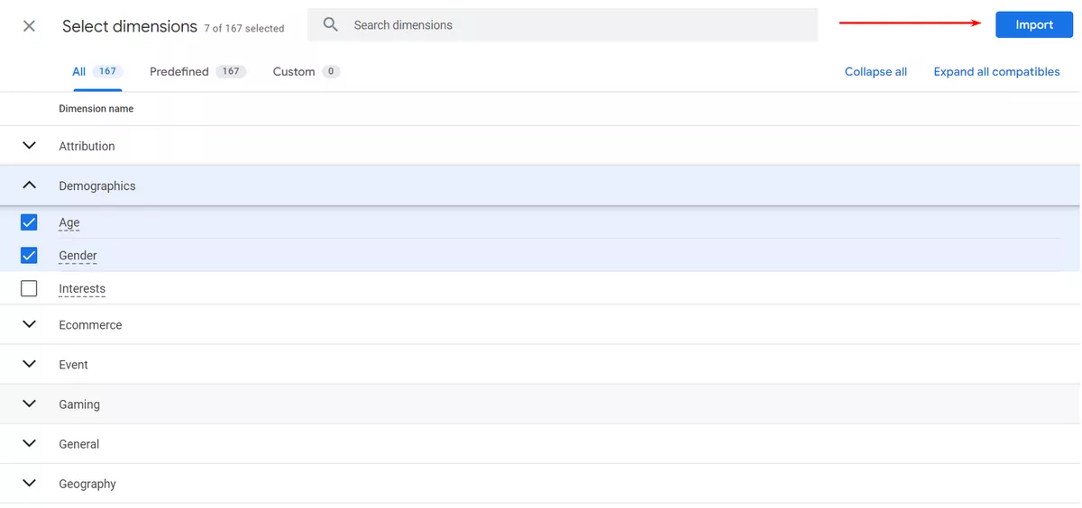
To create your report, first include the dimension or metric in the Variables column. By clicking on the Plus icon and selecting the dimension/metric.
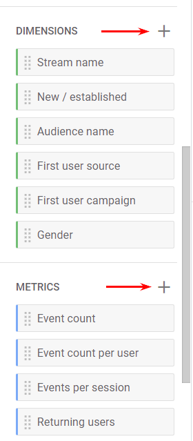
After you select the intended dimension/metric, click on the Import button in the top-right corner.
Some analysis techniques do not allow you to use certain parts of the Variables column. For instance, funnel exploration reports do not allow the inclusion or use of metrics.
To sum up, the Variables column is responsible for the data input. If you want to use certain segments or dimensions, they must be included in that column. If you are missing something later down the line, you can add new items on-the-fly. Additionally, you can change the date range.
Tab settings
In this column, you can configure what the report will look like.
1. First, there is a drop-down menu where you select “Free form”.
2. Then, you will find the visualization section, where you can select from:
- table
- donut chart
- line chart
- scatterplot
- bar chart
- geo map
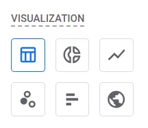
The choice of visualization method affects the customization options that will be available in that very same column. Tables are an especially popular and recommended visualization method.
3. In the Segment comparisons section, you can include up to four segments that are already included in the Segments section of the Variables tab. You can add segments to the Tab Settings column by dragging them from the Variables tab. Alternatively, you can just double-click the Variables tab, and they will be added automatically. If you have at least one segment added to the comparisons section, a new field will appear, Pivot. This field is responsible for the placement of segments in the table and offers four options: first row, last row, first column, and last column.
4. Rows. Here, you can select the dimensions you want to use in the rows of the table. Every row of the country report contains a different country name. If you want, you can include multiple dimensions as rows. Different combinations of all dimensions will then be displayed as a separate row. Here is an example of a report with two Row dimensions: city category and country.
Also, you can select the row to start from and the number of rows to display at the same time. If you work with multiple dimensions, consider switching to nested rows.
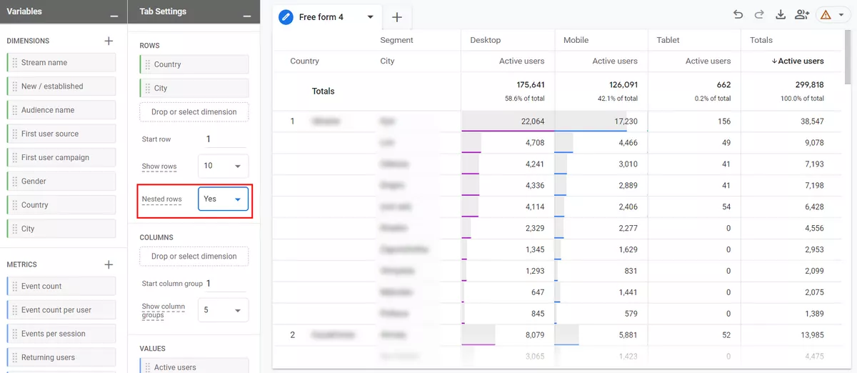
This will make the report more visually appealing.
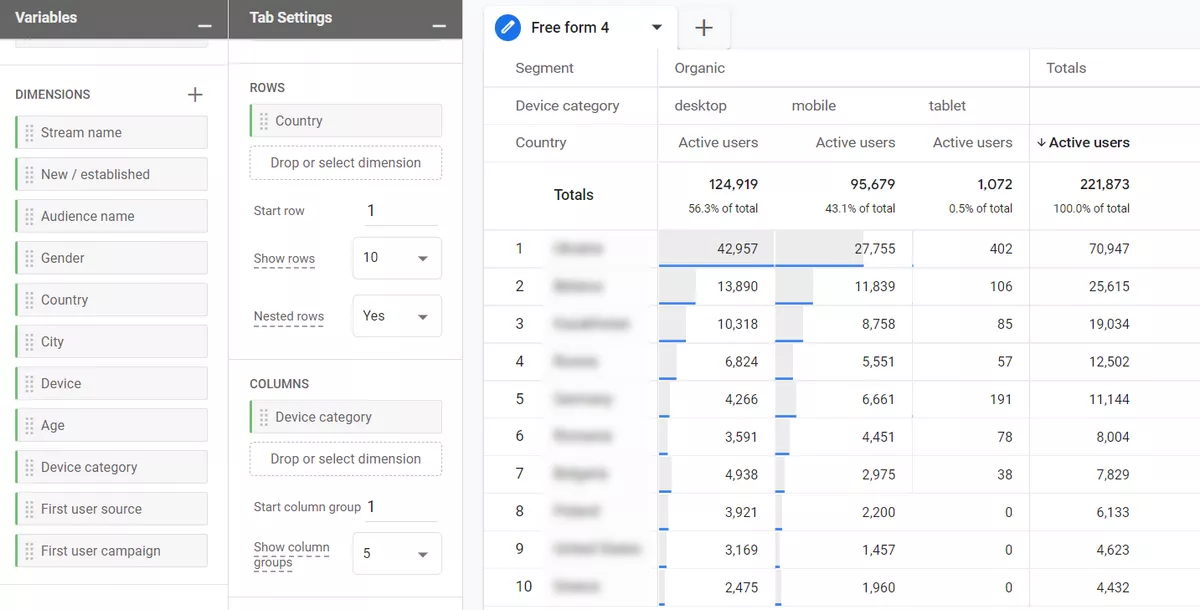
5. You can also add dimensions as columns. Look at the examples of browsers and device categories.
6. In the Values section, you can drag metrics that you want to display as columns in the report. In one report, a maximum of 10 metrics can be added to this section.
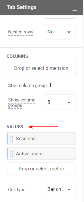
7. There are different cell types to choose from:
- Bar charts show horizontal bar charts in every metric cell based on its value and the ratio to other rows in the same column.
- Plain text displays all cells without any additional visual enhancements.
- Heat maps color cells darker if their values are higher compared to other rows of the same dimension column.
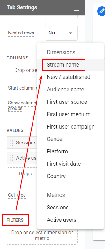
8. Filters allow you to quickly narrow down the scope of data you are using. Then, you can click on the placeholder and select the dimension that you are going to use in the filter.
Output (the report)
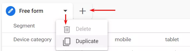
Once you configure all the necessary settings in the Variables and Tab Settings columns, the report will appear. Each tab can use a different analysis technique (free form, funnel exploration, etc.), so add new tabs if needed. You can also duplicate and delete tabs by clicking the Triangle icon next to a tab name:
Start over, undo, redo, and share the report, or download the report:

Right-click on a cell to see additional options:
- include selection
- exclude selection
- create segment from selection
- view users (in User Explorer reports)
Include only selection will add an Include filter (or multiple filters if needed) to the report based on the cell that is clicked. For example, you can quickly narrow down your report to users, events, etc.
Exclude selection will add an Exclude filter (or multiple filters if needed) to the report based on the cell that is clicked.
If you accidentally included or excluded a selection, you can delete those newly added filters from the Filters section in the Tab Settings column. Alternatively, you can click the Undo icon in the top-left corner of the report.
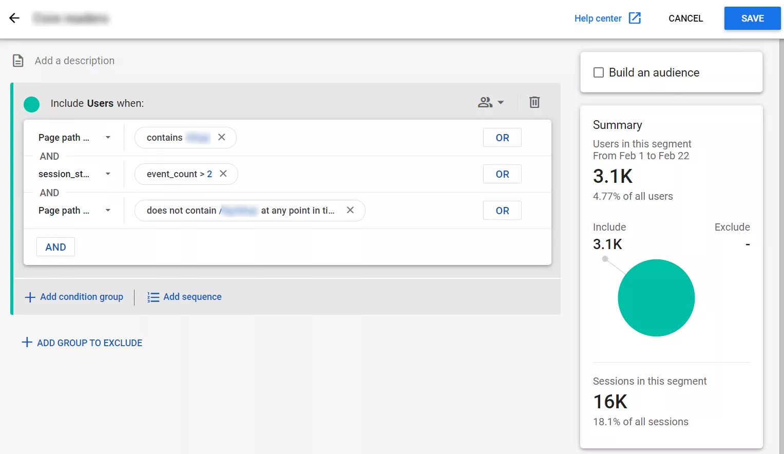
If you click the create segment option, you will see an interface of segment creation with some prefilled conditions.
The view users option will open a user explorer report about users that belong to that particular selection.
Conclusion
Custom reports will provide you with the exact information you need for your business, which significantly speeds up decision-making.
Google Analytics 4 provides a wide range of dimensions and metrics that you can include in your custom reports. Segments and filters can further enhance your data analysis.
To create a free form report, all you have to do is input the following parameters.
1. Variables:
- date range
- segments
- dimensions
- metrics
2. Tab settings. These determine the kind of report and the way it's visualized, how segments, parameters, and indicators are displayed. Filters can be used to narrow down the scope of data if necessary.
You will see the customized data in the Output of your report. Currently, other users are limited to viewing the generated reports.

 2
2
 1
1
 0
0
Recommended theme posts
Related Articles
Display Advertising Effectiveness Analysis: A Comprehensive Approach to Measuring Its Impact
In this article, I will explain why you shouldn’t underestimate display advertising and how to analyze its impact using Google Analytics 4
Generative Engine Optimization: What Businesses Get From Ranking in SearchGPT
Companies that master SearchGPT SEO and generative engine optimization will capture high-intent traffic from users seeking direct, authoritative answers
From Generic to Iconic: 100 Statistics on Amazon Marketing for Fashion Brands
While traditional fashion retailers were still figuring out e-commerce, one company quietly revolutionized how U.S. consumers shop for everything from workout gear to wedding dresses