Smartphone is not just screen. It’s absolutely different environment of online business, which has its rules and users behavioral patterns. If you applied desktop campaigns to mobile advertising banners and failed, you should definitely read this article.
Why should mobile banners be special?
According to Google, Search (+Play) campaigns type have the lowest CPI (cost per installation), but at the same time, the lowest reach. That’s where the Display Network comes in. Its CPI is higher, but the reach is higher as well.
When managing Display Network campaigns, user banner blindness (which is typical of both desktop and mobile) is not just one problem a marketer has to struggle with. He faces the issue of «catching» a user just in a few seconds of interaction.
Properly prepared banners are one of the key ways to succeed in Display Network.
Picture rules to succeed in mobile advertising
A picture should be bright, of high quality and «catchy». Mind that you have less time to communicate with a user as opposed to the desktop advertising.
Choose a picture considering the peculiarities of the target audience.
When creating advertising banners, remember your target audience and go even further. Advertising systems like Google AdWords, Facebook, Instagram, aggregate data on users and allow to distinguish audience segments.
You may apply age, gender, geographical segmentation and narrow targetings based on the users preferences almost to every product or tool. So choose the pictures considering pre-segmented audience and don’t make creative banners which concern everybody and nobody at the same time.
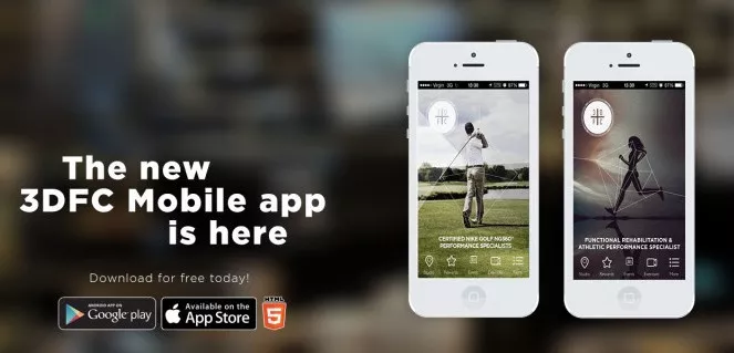
If the target audience of your application predominantly consists of women, that would be better to show a smartphone with an app in the woman’s hand, if it consists of men — in the man’s hand.
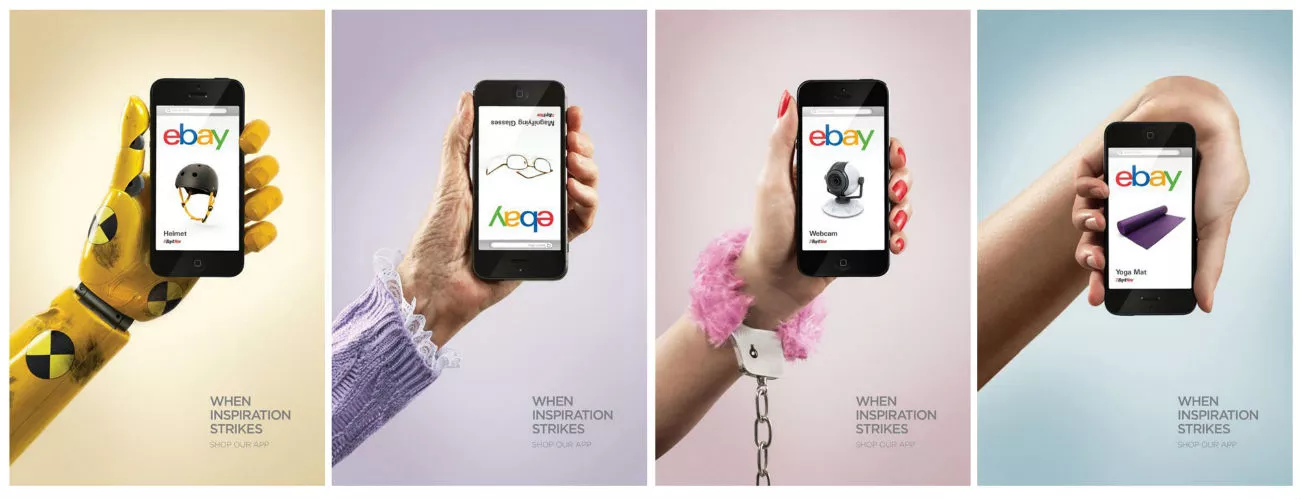
Leo Burnett’s work for Ebay application
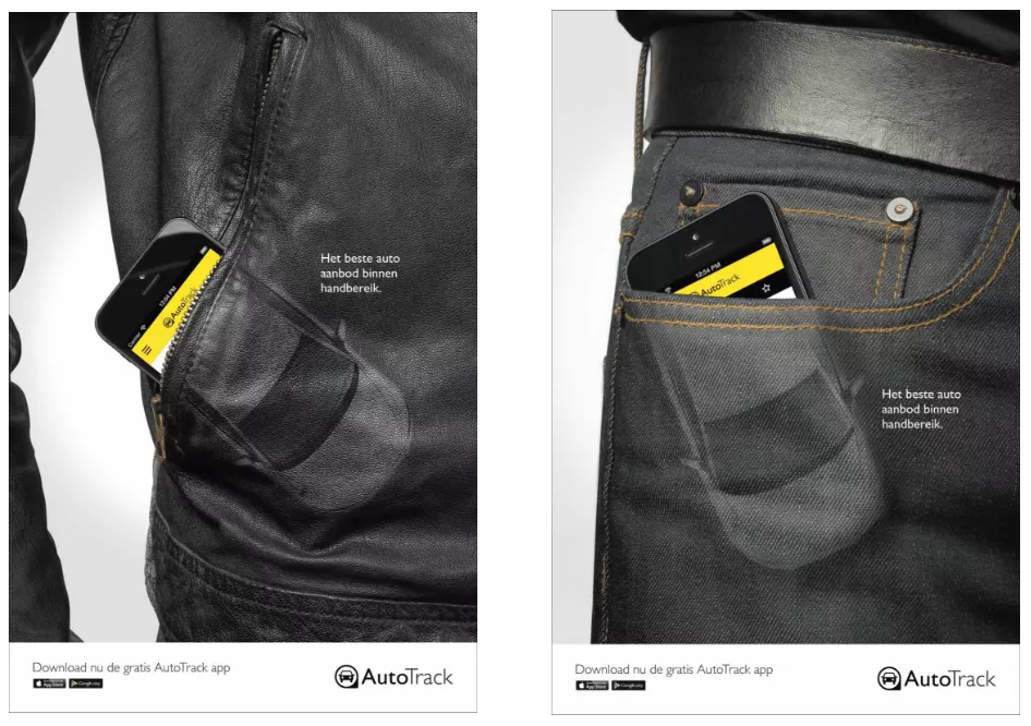
Or like this: dark jeans, leather, black iPhone and car outlines. Brutal and clear advertising banners created for men
Experiment
If an advertising looks bright, original and engages users, it’s definitely a success. It’s important not only to convey the message in the language the user understands, but to differentiate your service/product from others.
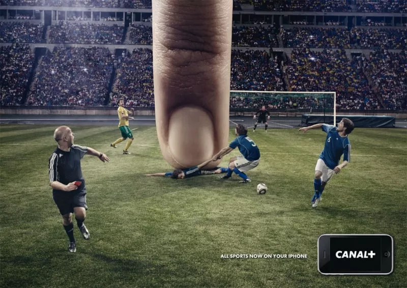
iOS app advertising of French Canal + for football fans.
You should clearly realize the campaign goals and choose banners on their basis.
E.g. If it is a banner for Google AdWords or DoubleClick, the size of which is 300*50 or 320*50, the main goal is not to reveal a complex plot, but to convey the main message.
Follow trends. Be trendy
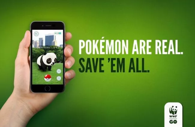
Two years ago, everyone was interested in the new part of the «Star Wars» saga. And listened to the song about the Louboutin shoes. And watched the Deadpool movie. And a year ago, only the lazy advertiser didn’t use Pokemons in his banners. Even WWF (World Wildlife Fund) didn’t remain uninvolved:
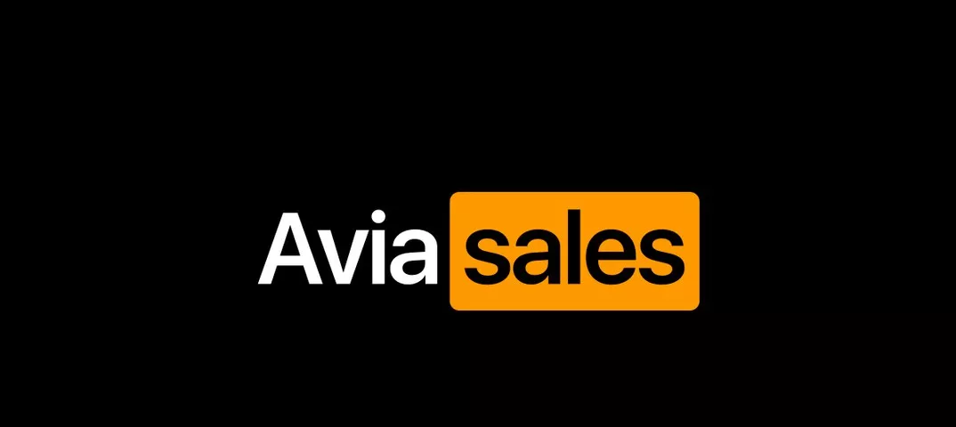
Aviasales did well with the PornHub blocking issue. Be like Aviasales:
Situational marketing is SMM’s weapon. But why not to use it in the performance marketing? The reason is that you have to react quickly. And place banners quickly. Otherwise, the pictures that have been prepared by designers for so long will lose their relevance.
You should also remember that the life of the advertising banner is short. E.g. A banner in Facebook, which yielded excellent results several days ago, may show much worse results today. This means that the banners «burned out» became familiar and bothered users. Then it’s time to replace them with the new ones.
Learn the activities of competitors
Be always aware of the advertising activity of your competitors. Publer service will be of use for you. This service allows to monitor the advertising posts of the competitors in social networks and the targeted advertising in Instagram.
If you know what competitors do, you’ll be able to participate in the Brands Wars:
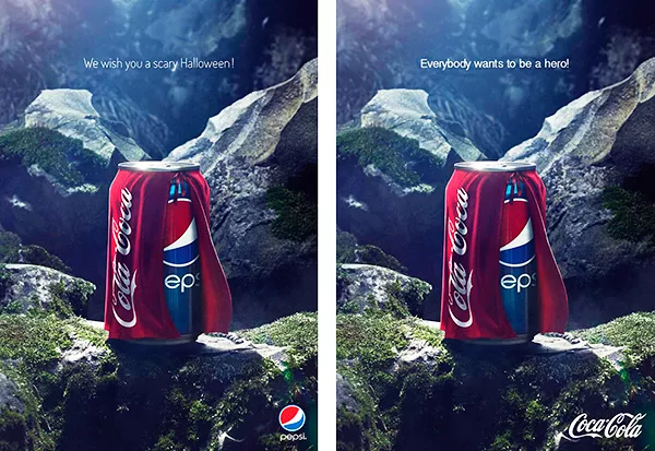
Adopting the most successful ideas of the competitors is not bad. Being less effective in marketing communication with a mobile user is.
Text rules to succeed in mobile advertising
Mobile banner text must complement an image and be as simple and clear as possible.
Explain the products advantages
There are a lot of offers in the market similar to your one at the first sight. Enrich your banner with a unique selling proposal, which only your business can provide.
Don’t make the promises you won’t keep
The banner tells that the price for cups with raccoons starts from $4,5 but in sober fact their cost starts from $45. Don't be like that! You may get high CTR of the advertisement, but not a big profit and a ruined reputation in the eyes of your business.
Speak the language the audience speaks
Use a slang if necessary. But remember the target audience and the advertising channel you show a banner to. How to find that fine line between the boldness and the trash. Speak the language the audience speaks.
Analyze users’ preferences
You thought that your product audience was children, but it turned out to be interesting for adult bearded men? So it goes...

Use the application analytics, study reports on the current advertising activities in the context of the audience sex, age, the most effective targeting and banners, and then implement this knowledge in marketing communication with the new potential product audience.
Use readable fonts
Classiс fonts: Arial, Verdana, Tahoma. Use sans-serif fonts. You have only a few minutes between the users scrolls to convey your message. Make your text not beautiful but readable. Use special bookmarklets to check the text readability.
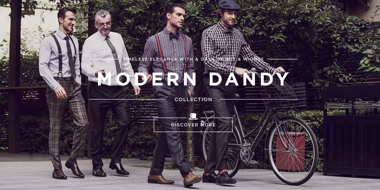
Mind the contrast of the background and the text
A big stylish photo and a stylish plaid. But what is the text on the top line?
One more example. This is one of the advertising banners in Facebook designed by the British studio for Netpeak client. We recommended:
- not placing yellow elements on the yellow background;
- using colors from the Google Color Palette.
Additional elements
Add App Store or Google Play logo/icon
You may also add the name of the app, so that the user doesn’t have to guess the things you advertise. The simpler the banner is, the better.
Use Call to Action
This is a button, a slider, a checkbox. That is the graphic element that makes a user click on the banner.
Dealing with other advertising formats
Besides the banners, use dynamic advertising formats as much as possible. They are highly efficient due to the interactive communication with the users. E.g. carousel in Facebook and Instagram, as well as slideshows and circle gallery in Instagram and Facebook.
Don’t be afraid to use new advertising formats which are only tested by the platforms. Advertising system always give them preference.

Example of the Deezer music app circle gallery in Facebook.
If you publish slideshows in Facebook, support recommendations on image size are the following:
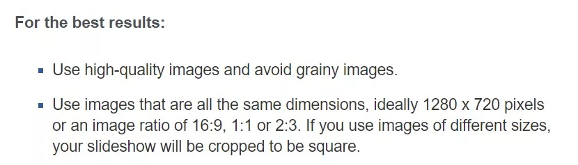
The horizontal image in Facebook feed will be of small size:

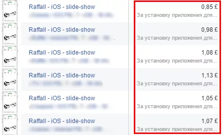
As a result, such a format is hardly efficient:
The square image will look larger:
Square slideshows in mobile Facebook have higher CTR than the horizontal images recommended by Facebook support. So, square advertising banners and slideshows are more effective. Even if such banners are of simple design, they are better:
Conclusion
General rules for creating images for mobile banners:
- Choose a picture considering the peculiarities of the target audience.
- Be creative. Don’t be afraid of experiments.
- Use situational marketing
- Use Publer to learn the activities of competitors.
General rules for creating texts:
- Explain the products advantages.
- Don’t make the promises you won’t keep.
- Speak the language the audience speaks. Use slang if necessary.
- Analyze users’ preferences.
- Use readable fonts.
- Mind the contrast of the background and the text.
Add App Store or Google Play logo/icon, CTA.
Use dynamic advertising formats (slideshows in Instagram and Facebook, etc.) and new advertising formats. Such ads are more difficult to prepare for the designer and take much more time to publish for the Internet marketer, but it is worth doing.
Remember: the desire to distinguish your product/service is laudable, but the banner space is limited. For small sized banners in AdWords or DoubleClick, it's more important to accurately convey the key message on a limited area than to tell a unique story. When considering your advertising strategy, don't forget about the potential of eBay marketing to reach a vast audience of online shoppers and drive sales for your products.
The article was written in co-authorship with Tania Kichuk.

 15
15
 2
2
 13
13
Related Articles
How to Set Up Consent Mode in GA4 on Your Website with Google Tag Manager
Let's explore how to properly integrate consent mode in GA4, configure it for effective data collection, and at the same time comply with GDPR and other legal regulations
Display Advertising Effectiveness Analysis: A Comprehensive Approach to Measuring Its Impact
In this article, I will explain why you shouldn’t underestimate display advertising and how to analyze its impact using Google Analytics 4
Generative Engine Optimization: What Businesses Get From Ranking in SearchGPT
Companies that master SearchGPT SEO and generative engine optimization will capture high-intent traffic from users seeking direct, authoritative answers