Some time ago we launched an advertising campaign with marshmallows. During this campaign we became acquainted with Olga Tsymbal, a copywriter from the G2 Grey Ukraine company. She was fond of marshmallows, but she also scolded us for the fonts we used on the plate for them. So we asked Olya to give us a kind of master class about basics of typography. That’s where this post comes from. We are certain that this information will be usefull for everybody. Let’s start with a joke: designers’ kids don’t have toys, they play with fonts.
Amazing history of fonts
– Tell us about yourself. How serious are you when it comes to working with fonts? – I work as a copywriter and editor, so every day I deal with a certain amount of textual and graphic information. When I’m working with content, stylistics, grammar and spelling, I’m bound to pay attention to visual appearance of text. I’ve been seriously involved with design and fonts since 2001 – that’s when my family purchased our first computer. I studied Paint, Microsoft Word and PowerPoint all day long and kept forgetting about everything else. Photoshop, Illustrator and Corel Draw came into my life much later. InDesign is next in line. So professional linguistic education doesn’t always mean total ignorance of visual culture – it’s quite the opposite.

If you love a word, you have to make sure that it’ll “feel” comfortable on screen, paper or any other surface. This way reader will give the word a necessary share of attention.
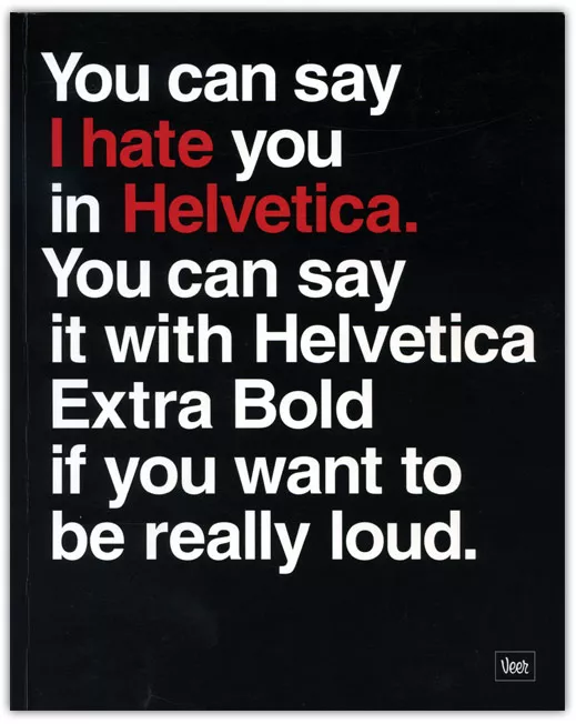
Quality design, illustrations, content is a must today, but there are not many specialists in our country that pay attention to typography. Classic definition of typography is a graphic decoration of printed text with typing and typesetting according to rules of particular language. Main aspect of typography is usage of fonts. Unfortunately, you can count professional Ukrainian font designers with fingers of one hand. Nevertheless it’s not an excuse for a chaos in our typographics. Yes, our compatriots really can draw and design, but they don’t treat fonts with proper respect. Anyone can master basic rules of quality typographics and sense of font styles with a fair share of desire to do so. I’ll point out main aspects of typographics. The rest can be easily found in Web. Imagine this: a young man found out about such a popular job as a “designer”. He studies basics of graphic editor on PC (probably Corel Draw) and creates his first layout. It’s easy to identify a newbie by creative appearance of his works: insane compilation of fonts (creator is probably showing off wide variety of fonts on his computer) plus florid titles, complete ignorance of typesetting rules and wild colours. Don’t get me started on technical moments like image resolution or pre-press preparation. Of course, our newbie wants to try everything at the same time. Majority of Ukrainians think that beautiful means flashy and diverse – it’s in our mentality. This is a common stage for all designers. It’s crucial for them not to stuck in this stage forever.  Streets of our cities and villages suffer because of post-Soviet designers. Majority of them are just amateurs or pros stuck in last century at best. They use typefaces from basic Microsoft set without thinking twice. And these are not even the best typefaces they have. For example, popular Arial font is nothing else but slightly changed Helvetica. This font was created back in 1957, it’s considered to be the face of global typography.
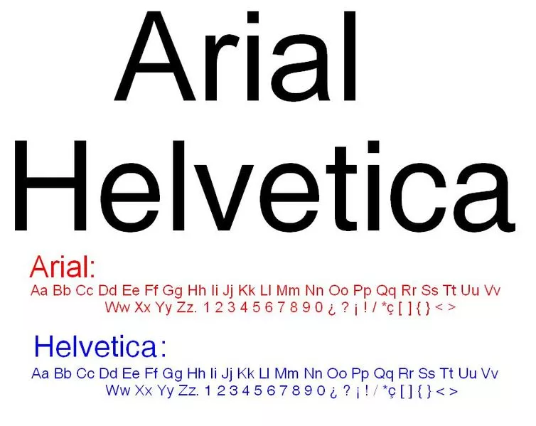
So where can you get a typeface that isn’t included in basic set? You can just download font file from Internet and install it on your computer. You’ll have to purchase some fonts – and this is actually a fact some customers and even designers are not even aware of. At the same time major companies and large projects create personal corporate fonts. That should be rather norm than exception. Right now branding of places becomes a popular trend, so it goes without saying that logo, slogan and other brand elements should be accompanied with a custom-made font that depicts spirit and values of particular place. 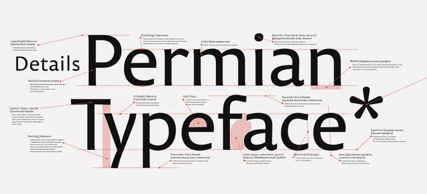
One of basic principles of typography is that font should match the content. It should completely obey the meaning and purpose of text. It should make text easier to read, not harder.
Remember: typographic should serve the text, not other way around! So keep in mind psychological perception of fonts, study basic classifications, rules of using them and combining with other fonts, pictures and paper, if we prepare a printed edition. When you choose a typeface, define the main purpose of using it. Textual fonts have simple lines and forms, they are easy to read and that’s why the’re used for main text. Display fonts (decorative ones) should be used for headlines, subheadings and small inserts for layout decoration. Treat them with caution: large texts typed with such typeface are unreadable. 2 different display fonts rarely combine properly. You should choose decorative typeface elaborately: it has to match content and style of design. It’s acceptable to combine only two fonts within one layout, maximum – 3 fonts. But one typeface can have several kinds of tracing (upright or italic), saturation (bright or bold), width and font size – these are variable features of one typeface.
There are three groups of fonts based on structure: Serif, Sans Serif, Slab.
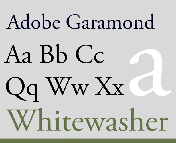
Serif typefaces come from ancient ages and have serifs – small elements on ends of symbols’ strokes. Serifs make reading easier, that’s why these typefaces are usually used in books or large articles in periodic editions (for example, Baskerville, Garamond, Lazurski). 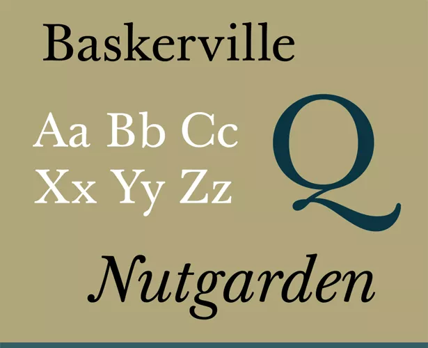

Reader perceives text with slim typefaces with sharp angles negatively. At the same time, soft and round typefaces are friendly and likeable. The bolder is the font the more powerful it is in terms of persuasion.
What about fonts for Web?
Today we practically live in Web. There are typographic symbols on monitors, but different rules apply to them. If Baskerville or Times are the best for print, texts for screen should rather be in Verdana (optimal size 10–12 points). 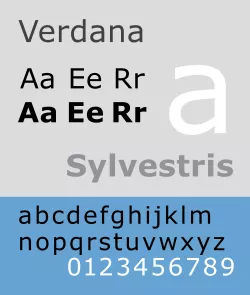
Recommended line length in English is considered to be 50–60 characters per line, including space. Spacing is 120% (for spaces) and 140% (for screen) compared to font size.
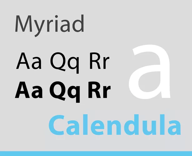
If lines are too long or too short, if spacing is too small or too big, it’ll be hard to read the text. Spacing between letters also matters: text shouldn’t be neither too rarefied, nor too packed. Additional spacing is only acceptable for words or lines typed with capital letters only. But remember that such typesetting as well as italic one is hard to read to begin with, so don’t overuse it! Sometimes you have to do choose proper distance between symbols manually. Every designer has a few favourite fonts he/she uses practically in every project. There are hardcore fans that use only 2–3 typefaces, but I think that it’s too extreme. There are lots of good quality fonts, so why should you limit yourself? My favourite typefaces are Myriad, Officina, FreeSet, Futuris. As my fellow designers I dig Helvetica. Although I’m not actually a designer. Overall I prefer modern Sans Serifs with clear lines and simple forms because I appreciate minimalistic and functional designs. I’m not a fan of Serifs (maybe it’s because I work in advertising, not book publishing). But Georgia typeface is a pleasant exception: it pleases the eye on paper as well as on screen. 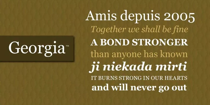
Translated by Anastasia Zdorikova.

 0
0
 0
0
 0
0
Related Articles
Display Advertising Effectiveness Analysis: A Comprehensive Approach to Measuring Its Impact
In this article, I will explain why you shouldn’t underestimate display advertising and how to analyze its impact using Google Analytics 4
Generative Engine Optimization: What Businesses Get From Ranking in SearchGPT
Companies that master SearchGPT SEO and generative engine optimization will capture high-intent traffic from users seeking direct, authoritative answers
From Generic to Iconic: 100 Statistics on Amazon Marketing for Fashion Brands
While traditional fashion retailers were still figuring out e-commerce, one company quietly revolutionized how U.S. consumers shop for everything from workout gear to wedding dresses