How does the face of every single startup looks like? The answer goes far beyond the ordinary “top official face” definition because when we talk about companies, we see them as a complex issue: it is the title page of its website.
Looking at the main page of the site, we can say a lot about its main goals and desires; the design in every particular detail of the page and all of them in general can indirectly tell you where the company sees itself within the market or where it wants to be in the future. And as the mission and the main goals of the company grow and evolve, the design of the main page also goes through numerous transformations.
This is the story of company’s life worth looking at, and that is the focus theme of a young inspiring service UX Timeline that offers its users to have a look at the number of well-known companies’ websites through the years and follow the process of their radical changes. They use Wayback machine and Google Images to visually present the process of the ongoing changes.
This service has been created by Jacinthe Busson, Project Manager at Elegantt.com. It is a perfect source of internet nostalgia for those users, who have been online for years. It is both an exciting way to kill time and an opportunity to follow the process of web design development in the last decades.
Websites’ timelines are connected into smooth chronological lines, although such combination is a no mean feat. In particular, it refers to the old websites that have years and sometimes even decades history of changes. The timeline formation process for such websites requires a lot of time and efforts, but still – Busson has made it quite gracefully and the final timelines produce a powerful impression.
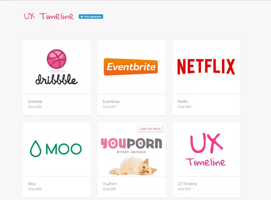
This service will be especially interesting for designers and software developers because it shows the results of working with the sites of well-known companies, such as MailChimp, Uber, AirBnB, Dropbox, Vimeo, Spotify, Netflix, Shazam and other.
UX Timelines
To properly evaluate this small, but extremely powerful service, we shall go further to the process of the design and implementation. UX timeline can be created for any website type, with the accent made on the start of a new project or upgrade of the old one thorough adding this feature to the site.
Specialists that work with such timelines know that the process of their creation takes a lot of time and efforts. Each UX timeline is unique, and its final look depends on the number and size of features used in it, as well as on the defined deadline. In general, the process of user’s experience implementation requires three months’ work. This is a complex process that can be divided into stages from elaborating the main strategy to the product development after the end of work.
Stages of the UX process:
- Strategy
- Research
- Design
- Prototype Building
- Usability Testing
- UX design deliverable
- Informed product development
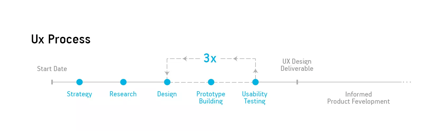
The UX process starts with three main aspects: discussing the general strategy, setting the main goals and defining expectations. The actual workflow starts with industry and client research that allows designers to elaborate optimal decisions about the final concept. This research defines the images of an average client, his desires and the tendencies within the industry.
At the design stage, the defined concept turns into a prototype that is tested by multiple users outside the team. After each round, the team of testers give feedback that is analysed to make required adjustments. On average, the team conducts three rounds of testing to fully validate all elaborated solutions. The final design is is transferred to the developer only after the team is sure that it has provided an optimal solution to all clients’ needs and met all the main goals.
Time for the timeline
There is no need to need to explain why one of the main questions about UX timelines is why do they take so much time. Working with UX automatically extends the general timeline of the project, but this investment is supposed to bring you benefits in the future. UX is a user-focused design, with strong goal orienteers that guarantee that your product will directly meet the desires of your target audience.
The best proof of UX timeline’s reliability is the comparison of the timeline with UX and the timeline without it.
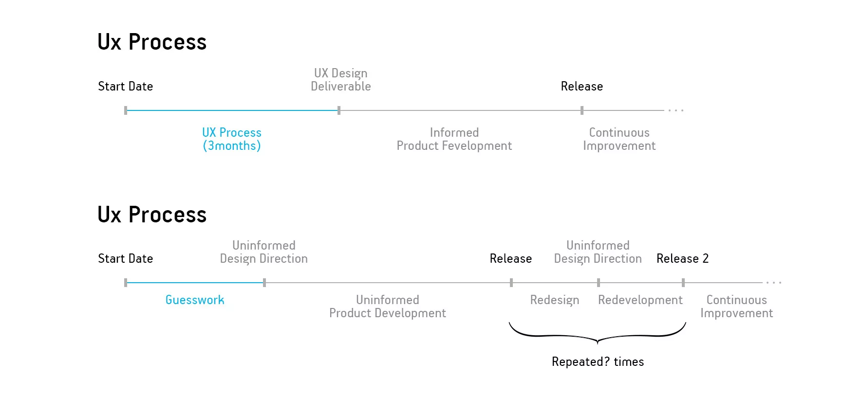
The workflow requires coordinated work of both designers and customers. When the first one create the basis for the decision making and the second ones decide, the result of their work is the design deliverable. All interaction patterns are based on the series of tests, analyses and researches, and that helps the development team to clearly understand what do they have to do and how it can be done better and in a short period of time. However, even the following type of work does not succeed in providing the most effective decision for both the team and the final user. When customers wait for the first release of the product and decided to put ordinary users in the middle of the process, they provide a sub-par experience.
As a rule, this results in a stressful post-release. The team enters the hard period of complete redesign and redevelopment of the project. This stage is the most complicated one because the product has already been established to the public and that seriously limits the space for the maneuver for the developers. They are now stick to the concrete concept and have to provide effective solutions within the particular frame. That is why we are talking about three months period and still – you have to understand that there has to be some extra time left. But when talking about UX timeline, this is a strategic move that is definitely worth it.
Going Further
Now, when we have analysed the UX Timeline service and have deeply researched the real value of working with UX in general, it’s time to have get aquainted with the actual look of timelines Busson has created. The accent here has to be done on the site that has already become a household name: MailChimp.
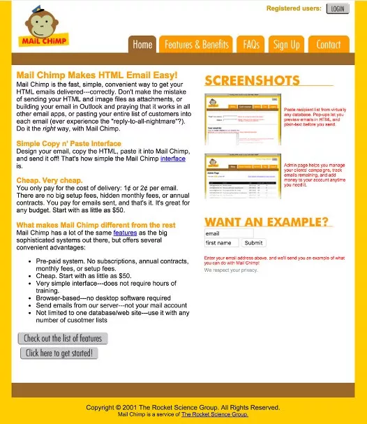
The fact that MailChimp has quite a long history that started long before 2010s, will be a surprise for the majority of its users. The service was founded in 2001 and has gone through the series of significant changes.
Here is how MailChimp looked like in 2001:
And now, let’s go back to its contemporary appearance:
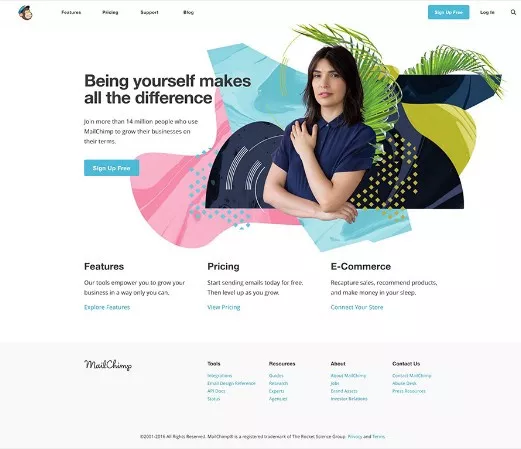
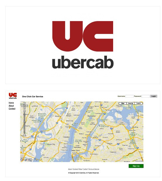
The service has changed a lot, and that is one of the evidences of the evolution of the service. MailChimp is currently the oldest site on the list of UX Timeline, but that does not make other sites’ timelines less interesting. Have a look at Uber that started its work in 2010, but still it it has changed almost everything about its design and the general structure of the site:
That is how Uber looked in 2010:
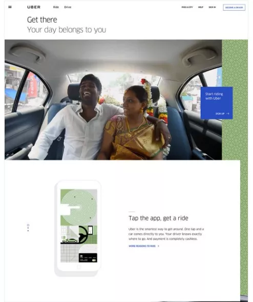
That this is Uber from 2016:
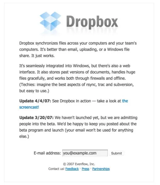
At the same time, timeline gives a new observation of the key elements that companies try to keep through the years. There are colors, slogans and logos that remain almost the same, perfectly adapting to the new design. Look at the history of Dropbox –the service that will celebrate its 10th anniversary in 2017.
That is how Dropbox looked in 2007:
Not that impressive. And here is how it looks now:
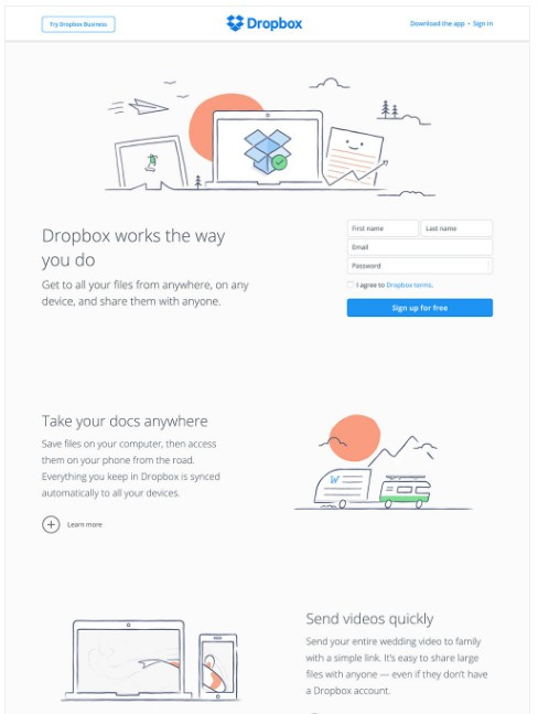
An interesting fact: it did not change since 2015. The design, text size and font, visually and structure of the site has changed; but what catches the eye is the logo and name of the service that still have their brand design, colors, size and font. The rest of the colors have been changed in accordance with this key element that looks no less modern and relevant than the other info blocks and indirectly highlights the stability and relevance of the overall service.
For the moment, the service is looking for the new sites to be added to the list. It is unknown who is next, but it is possible to take part in the process by giving your vote to your favorite. Moreover, I highly recommend to review the timelines of all services presented on the site.
Conclusion
UX Timeline has emerged in the period of growing popularity of new approaches to the overall design of the website. However, the observation of all structural changes that took place in the history of top services is not only providing a deeper view over the UX timelines in general, but gives real life examples for those who are currently thinking of changing their site design because of its inability to attract clients, irrelevance, complicated structure or the necessity to come in accordance with the overall service changes.
The current list of already tackled services is not big, but all of them are worth looking through because their website design can tell a remarkable story of their success that is a good manual for all who are working within the sphere of internet marketing. Noone of them has started with a perfect logo, ideally matching colors and excellent structure; some of them have even not been the type of service we know now, and that adds value to the service that tracks their unique history.

 2
2
 2
2
 0
0
Related Articles
How to Set Up Consent Mode in GA4 on Your Website with Google Tag Manager
Let's explore how to properly integrate consent mode in GA4, configure it for effective data collection, and at the same time comply with GDPR and other legal regulations
Display Advertising Effectiveness Analysis: A Comprehensive Approach to Measuring Its Impact
In this article, I will explain why you shouldn’t underestimate display advertising and how to analyze its impact using Google Analytics 4
Generative Engine Optimization: What Businesses Get From Ranking in SearchGPT
Companies that master SearchGPT SEO and generative engine optimization will capture high-intent traffic from users seeking direct, authoritative answers