Product presentation has a direct impact on conversions and sales. Products that are well-presented and look appealing are more likely to attract customers' attention.
In this article, I'll discuss the differences between the mobile and desktop versions of Amazon product pages. I will explain how to influence product visibility and provide product page optimization tips based on the experience of the Amazon promotion team.
Mobile vs. Desktop
In 2020, 64.9% of customers reported that they preferred shopping on Amazon using a desktop device. However, this percentage has been shifting in recent years in favor of mobile devices and mobile apps, which account for 16.6% and 13.6%, respectively.
More than half of the world's Internet users access the web from their mobile phones, so a customized Amazon account will increase conversions. At the same time, the desktop version remains important as many users still prefer it.
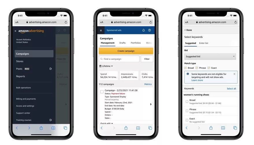
Amazon is already embracing the increase in mobile traffic and actively adapting its services. For example, the advertising campaign management console has been updated for easier use on smartphones and tablets:
How to review traffic from devices
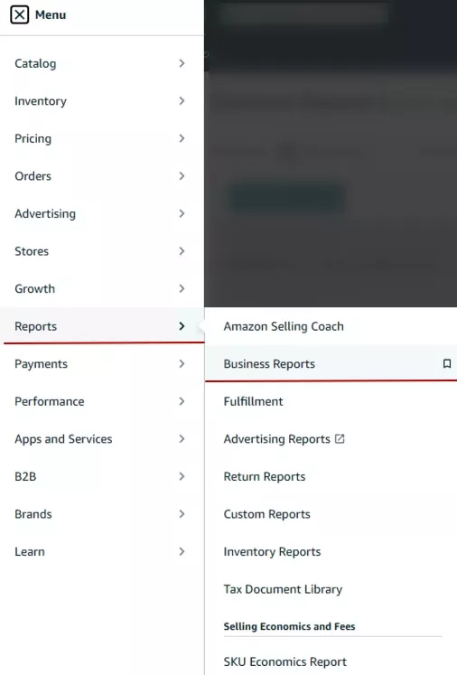
Sellers need to know which devices are driving the most traffic to their pages. Amazon Seller Central tools can help you do this.
- Sign into your Amazon Seller Central account.
- Go to Reports.
- Select Business Reports:
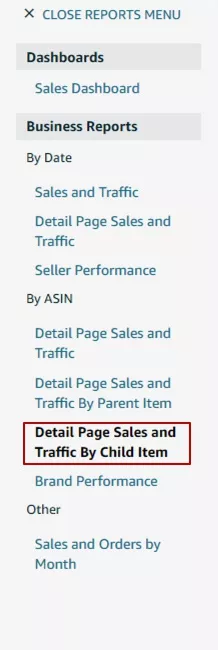
- Select By Date > Detail Page Sales and Traffic by Child Item:
- Select the period you want and save the report:
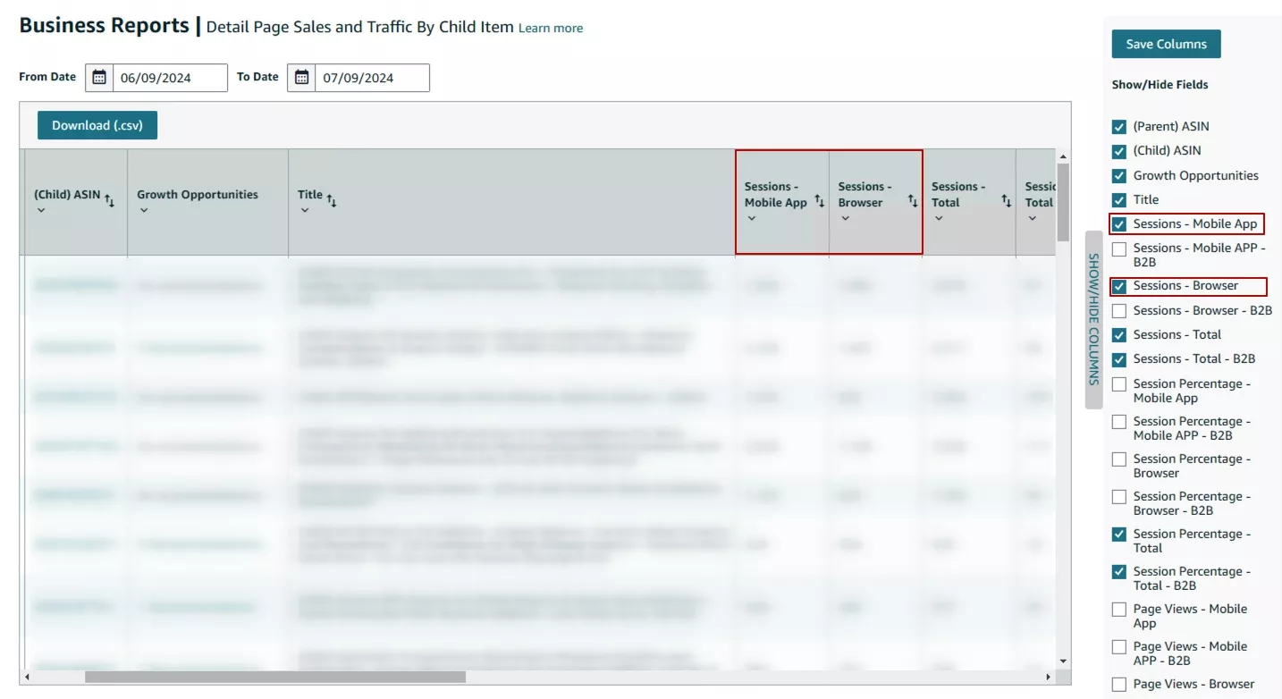
- For easier analysis, download the report as a .csv file.
By knowing the amount of mobile traffic to your store, you will be able to assess and decide if you need additional page optimization.
Amazon product pages
There are three types of pages on the marketplace where users see products:
- Brand store
- Search results
- Product pages
Next, let’s examine what each type of page looks like on a computer and a phone. I will then share recommendations for making them more visible. If you're also looking to drive traffic to these pages through ads, check out this guide to Amazon PPC.
Brand Store page
The Amazon Brand Store is a special page for registered brands where sellers can present a range of products in the format of their own mini-store. It is a unique environment that reflects the brand's identity and showcases its products.
Any seller registered in the Amazon Brand Registry can create a brand store. On desktop devices, the Brand Store page looks like this:

Clickable banners are placed here, in one or more columns, depending on the style. The top menu contains the store categories, and clicking on them opens a list of subcategories. The search field is located next to it.
Now let's look at the same site, but on a mobile device:

As you can see, the Brand Store page resizes content to fit the size of the mobile device:
- Categories are hidden in the drop-down menu.
- The search bar stretches to the full width of the screen.
- Banners become one line.
Also, the banners are different for the mobile version.
The desktop version has more options for banner placement, and it displays the page content in a compact way. In the mobile version, the banners are arranged in a column, which makes the page longer.
How to create an effective Brand Store page:
- Use high-quality images. Because the page resizes to fit the screen, low-quality images will not display well on devices with wide screens.
- Create a design in your brand's style. This will not only differentiate your site from the competition but will also help users remember it.
- Combine textual content with images. Users are not usually attracted to text-heavy pages, but images alone do not convey all the necessary information about your brand. Use both: present the most important information concisely in text and supplement it with images.
- Use clear calls-to-action (CTAs) so visitors don't get lost on the page.
- Check how content displays on different devices. A page may look great on an iPhone and a laptop with a standard screen diagonal but not on a tablet with a different operating system or a computer with a wider screen, so be sure to emulate the user experience on various screens.
Search results
This is a standard page that is available to all sellers. The user reaches it by making a request through the search bar. Here, your product competes with others and has fewer opportunities to stand out through design. But there are still a few ways of optimizing the page.
For a deeper understanding of how to improve visibility in search results, check out this comprehensive Amazon SEO Guide.
From a desktop device, the page looks like this:
The search filters are on the left. The rest of the screen is reserved for products, which are arranged in five columns. There is a maximum of 48 products per page. For single queries, for example, if you are looking for a book, the search results will have one column and a maximum of 16 products.
Depending on the type of product, two or three lines are allocated for the title, and longer titles are hidden under an ellipsis. You should keep this in mind when creating titles: place not only keywords in the first part but also a clear explanation of what kind of product it is.
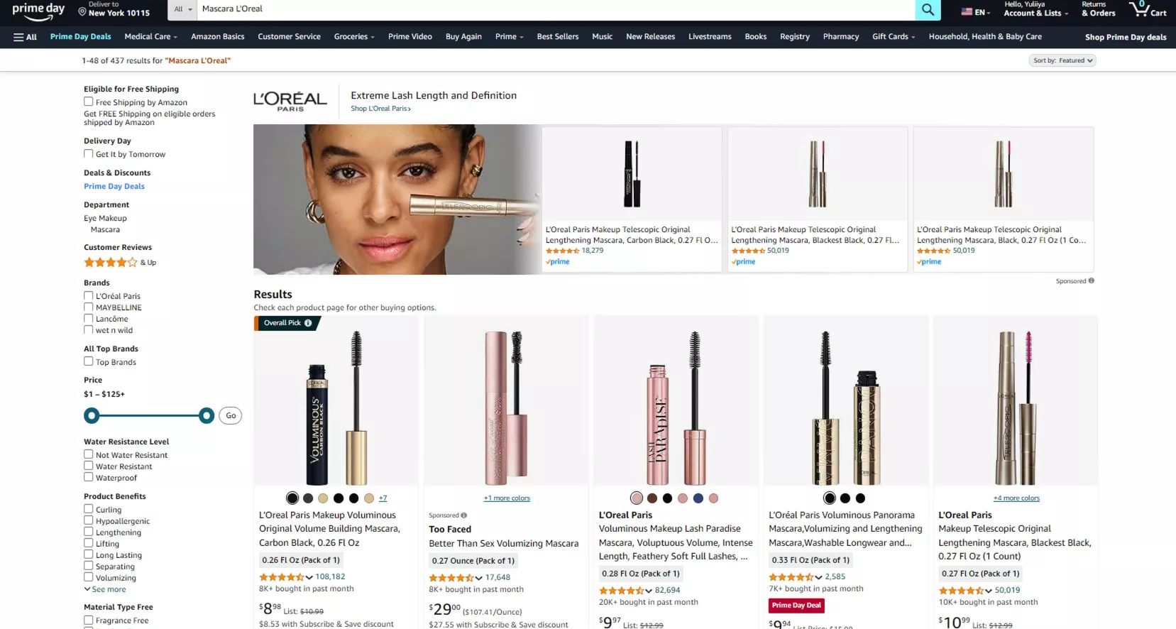
In the mobile version, the search results page looks like this:

Menus and filters are hidden in a drop-down list. Products are arranged one or two per line, with two or three lines for the product name, and other details are hidden:

It's harder to grab a customer's attention on small screens, so you must analyze competitors' photos and add bright or unusual accents to your own photos.
Analyze the product's characteristics: what components make up the product composition, what consistency does it have, and what are its unique functions? Then, highlight these details in the product photos.
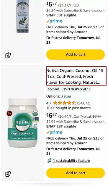
Here is an example using cosmetics:
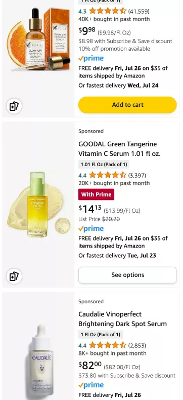
The first and second products use additional elements that complement the basic packaging, such as an orange to showcase the ingredients and product smears to highlight the texture. As a result, they look much brighter and more appealing than the third product.
Here is another example using bactericidal lamps, where the products are similar. However, there is still a way to stand out by showing the functionality in action:
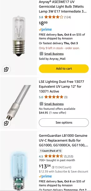
The first and third products are almost identical, but the third is more eye-catching due to the effect of light and color in the product photo.
The search results’ page photos can also include out-of-the-box creative content. For example, in the screenshot below, the microphone extends beyond the media block:
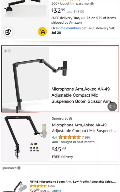
Creative photos are a great attention-grabber, but they're only available as part of setting up ad campaigns.
Product page
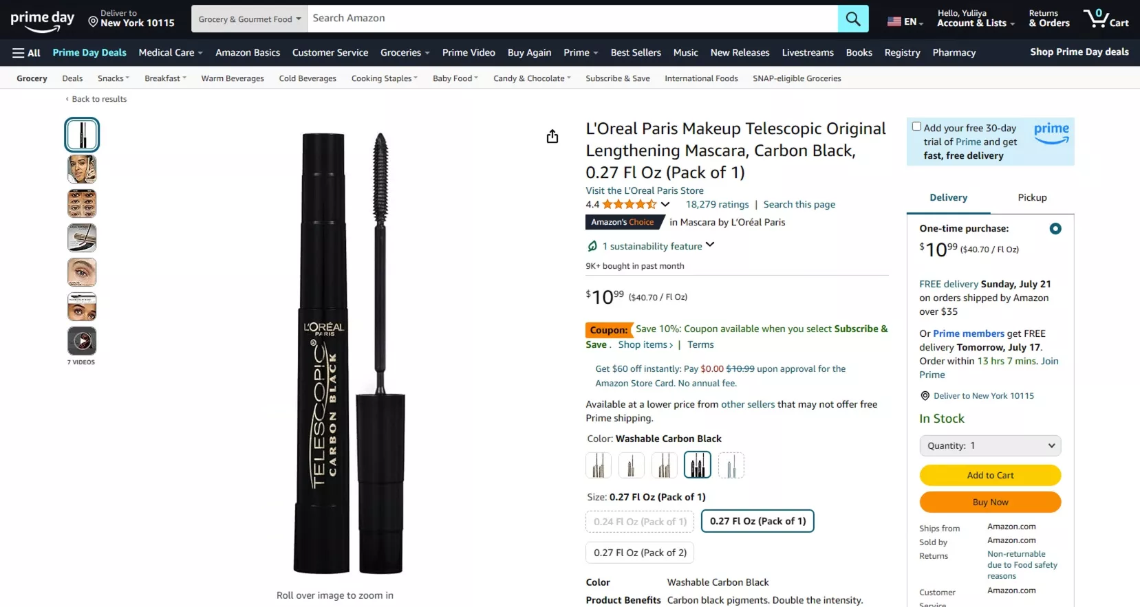
This is a separate page that opens when you click on a product card in the search results. The desktop version shows you the product's features on the first screen. In the screenshot below, you can see the photo, price, variations, and delivery terms:
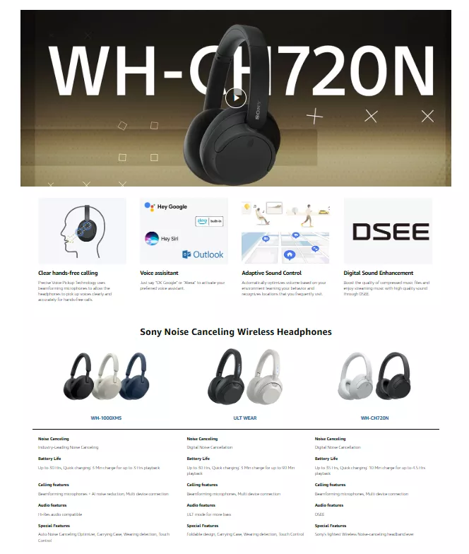
On the product page, you can use A+/A++ content to increase conversions. Here is an overview of A+/A++ content.
A+/A++ content on Amazon is an advanced marketing tool for sellers that allows them to create more visually appealing and informative product pages. The main goal is to improve conversions by providing customers with more thorough product information through graphical elements, detailed descriptions, and comparison charts. For example, the A++ content for headphones includes a video review and banners describing the key features:
Explore our expert article to understand how such content fits into a broader Amazon Marketing Strategy.
Take your Amazon listings to the next level with our proven Amazon SEO services.
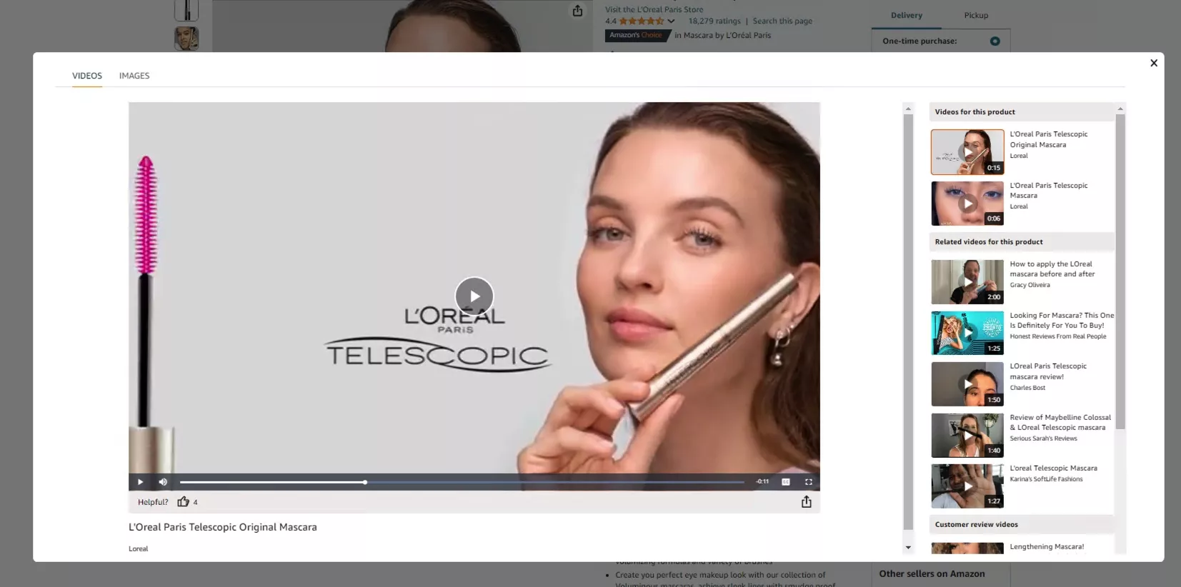
When you hover over a photo, the view zooms in. When the video plays, it takes up the full width of the screen:
Effective Amazon Listing Optimization ensures that mobile users have a seamless shopping experience, leading to higher conversion rates
In the mobile version, the first screen is the product name, photo content, and part of the block with variations:
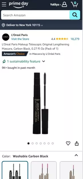
Double-tapping is needed to activate the zoom effect in a photo. Unlike the desktop version, videos will only play vertically and will not expand to full screen.

Mobile users have access to all of Amazon's core features, but some are limited or look different. For example, viewing product images is less convenient on a small screen.
Desktop versions of the product page offer more opportunities for detailed product research and comparative analysis.
Conclusions
- The majority of traffic to Amazon comes from desktop devices, but the volume of mobile traffic is growing every year.
- You can use Amazon Seller Central tools to find out the share of mobile traffic to your store.
- Users browse products on Amazon from three types of pages: Brand Store pages, Search Results pages, and Product Pages.
- To optimize your Brand Store page:
- Use high-quality images.
- Create a unique, branded design.
- Use both text and images in combination.
- Include clear calls to action (CTAs).
- Check what your uploaded content will look like on different devices.
- To make your product stand out on the search results page, use visual accents in the product photos.
- To increase conversion on the product page, use high-quality photos and videos and provide supporting information about the product.

 3
3
 1
1
 1
1
Related Articles
Display Advertising Effectiveness Analysis: A Comprehensive Approach to Measuring Its Impact
In this article, I will explain why you shouldn’t underestimate display advertising and how to analyze its impact using Google Analytics 4
Generative Engine Optimization: What Businesses Get From Ranking in SearchGPT
Companies that master SearchGPT SEO and generative engine optimization will capture high-intent traffic from users seeking direct, authoritative answers
From Generic to Iconic: 100 Statistics on Amazon Marketing for Fashion Brands
While traditional fashion retailers were still figuring out e-commerce, one company quietly revolutionized how U.S. consumers shop for everything from workout gear to wedding dresses