Data visualization is an integral part of modern web analytical services. It makes complex numbers and facts more easily understandable by transforming a mess of information into graphical images. In this article, I’ll explain what visualization is, who needs it, and what tools can be used to implement it.
What is data visualization?
Visualization is the creation of graphical images to represent data. It involves turning numbers into creative graphs, charts, and heat maps. The main goal of visualization is to make information easy to understand so that patterns and insights can be more easily recognized.
Why use visualization?
Visualization is a powerful tool for understanding and analyzing data. Let me list its benefits.
- Visualization makes data more accessible, as graphs and charts convey information better than dry numbers.
- It also helps you remember information since people retain images more easily than words or figures.
- Most importantly, it allows you to spot trends and anomalies.
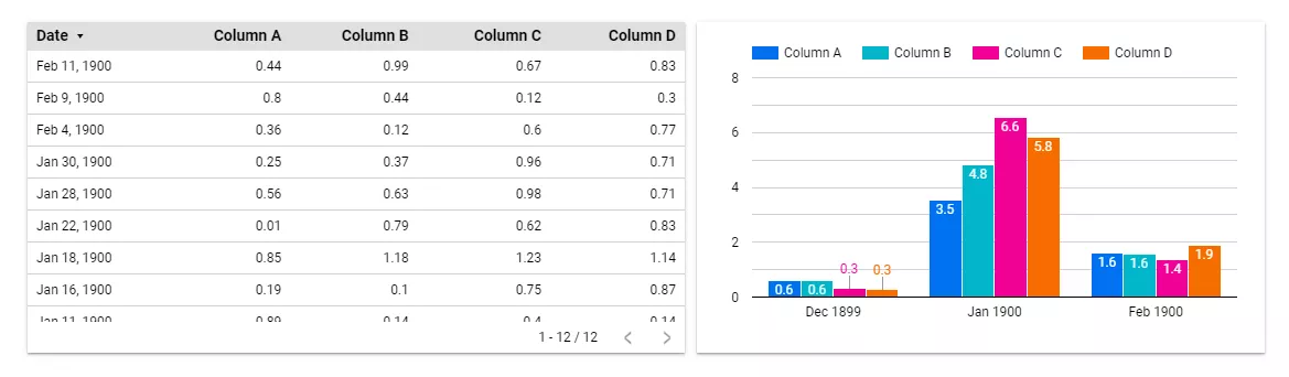
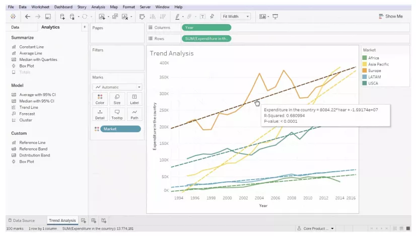
The numbers from the spreadsheet are visualized in a chart that shows the indicators’ dynamics over time.
Who needs data visualization?
For certain professions, data visualization is not optional. These professionals absolutely must have the ability to present information graphically.
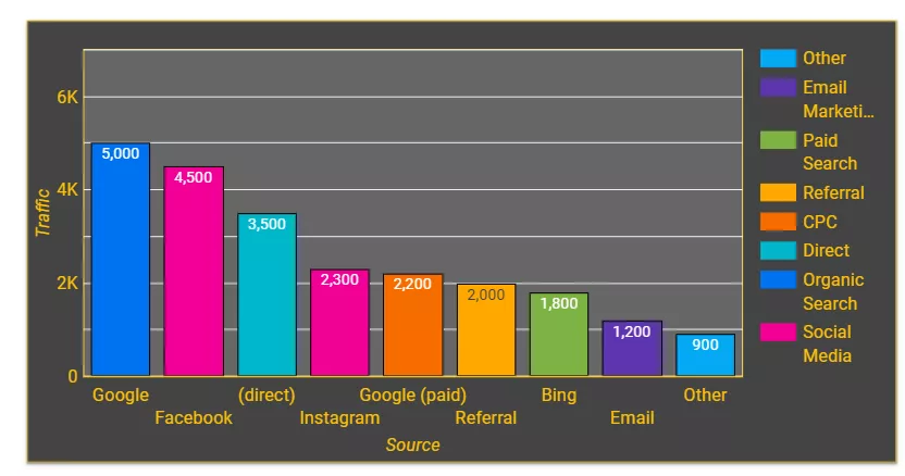
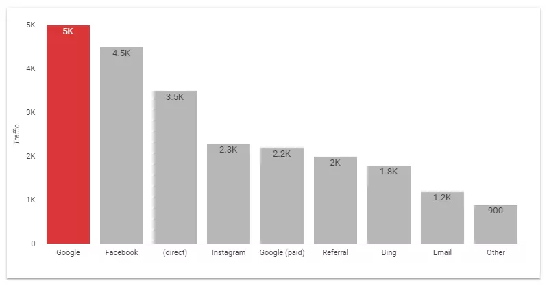
1. Marketers and advertising specialists. Graphs and charts will help specialists and clients understand the results of advertising campaigns. Based on the findings, they will be able to identify the most effective channels and find ideas for growth. Bar charts for comparisons and pie charts for highlighting key traffic sources are especially useful.
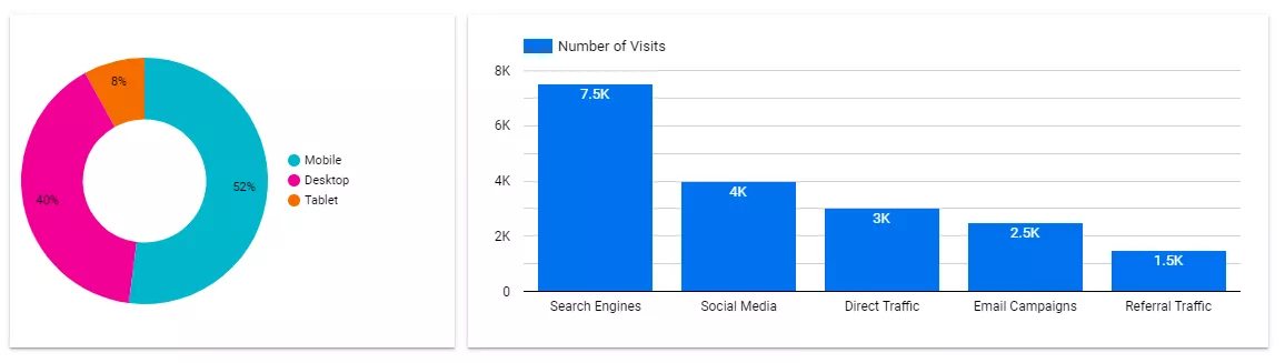
The chart on the left shows the devices used by site visitors. The fact that 52% of visitors used smartphones means that the site has to be adapted to different devices.
The graph on the right shows the number of users coming from different traffic sources. This data allows us to understand the effectiveness of advertising campaigns.
2. Analysts and researchers. Those who want to analyze and understand market patterns in depth cannot do so without visualization. Market analysts need heat maps that show patterns and differences and correlation graphs that reveal the relationships between variables. These graphics will reveal market trends and consumer behavior.
3. Business leaders. Simple and concise charts, such as pie charts and bar graphs, provide clear and concise information for strategic decisions. Business leaders can use them to evaluate key metrics quickly.
4. Website owners. Line graphs effectively communicate information about traffic and conversions, while heat maps reveal patterns in user interaction. Similarly, pie charts show where traffic is coming from.
5. IT professionals and web developers. Technical visualizations such as load and dependency graphs help IT professionals monitor site performance, identify problems, and optimize page loading.
The most popular data visualization tools
When choosing visualization tools, it is important to consider their versatility, accessibility, and ease of updating data. Let’s take a look at the most popular ones.
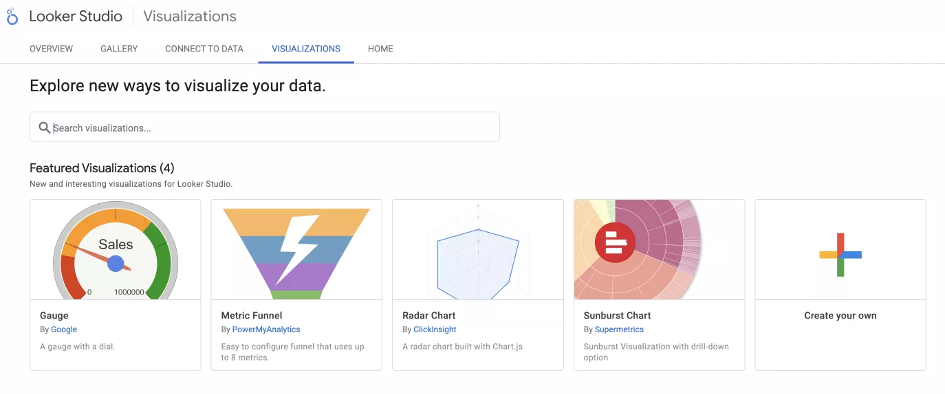
Google Looker Studio
This easy-to-use, stylish tool helps you create interactive charts and reports.
Pros
- A free tool that is useful for startups and small businesses.
- It has Google integration, so it works easily with other Google services.
- Offers the option to automatically update data, making it easier to keep information current.
Cons
- It is slow to process large amounts of data.
Microsoft Power BI (PBI)
PBI offers a wide range of features. You can use it to analyze large amounts of data and create charts and custom metrics. It uses two data processing languages: DAX (Data Analysis Expressions) and M (Power Query Formula Language).
Pros
- Integration with Microsoft guarantees that it will work smoothly with Excel, Azure, etc.
- Offers functionality for deep analysis.
Cons
- It can be difficult to use with Mac devices.
- Not for beginners. It takes time and effort to learn the tool.
- The Pro license costs $10 per month.
Tableau
This powerful tool lets you create creative charts and deeply explore data with interactive elements. Tableau is intended for those who appreciate high quality and are unafraid of complexity.
Pros
- The tool’s interactive features allow you to create high-quality charts.
- There is a large community of people who can offer advice and help.
Cons
- A high price of $75 per month. You have to pay for the whole year at once.
- It takes time to master its features.
Alternative data visualization tools
Google Data Studio, Microsoft Power BI, and Tableau are recognized market leaders. These tools are popular and deservedly so. However, depending on the needs and goals of the project, you may want to supplement them with additional tools.
1. Qlik Sense. This is a powerful visualization and business intelligence software with an intuitive interface. It is designed for independent users.
2. QlikView. Designed for experienced analysts, QlikView requires a deep understanding of data modeling processes. It performs well when working with large amounts of data and complex analytical tasks.
Cons:
- Working with QlikView requires more time and effort compared to other tools.
- The tool allows users to share current sessions with guests, but there is a limit to the number of users who can use a shared session simultaneously.
- Performance can drop when a large number of users share a single session.
3. Infogram. A simple tool with a wide range of templates, Infogram has interactive features that allow you to create simple and attractive visualizations. It is best for summarizing and explaining the results of data analysis.
Cons:
- Some of the default settings violate the rules of effective charting.
- The free version lacks analytical features.
4. Adobe Analytics. This is a data analysis tool with flexible segmentation, full control over data, and extensive integration capabilities. Adobe Analytics turns analysis into an engaging process of performance improvement and data exploration.
Cons:
- High cost. Depending on data size and package, it can be approximately $2,000–$2,500 per month.
- The tool can be challenging to learn.
5. Sisense. Due to its impressive analytical capabilities and high performance, Sisense is a good choice for complex projects. The company offers variable pricing and charges only for the services used.
Cons:
- High cost. Depending on specific needs and data volume, a developer license is $125/month, a standard license is $60/month, and a review license is $30/month.
- A powerful computer is required to run the program.
- It may be difficult to set it up.
6. Grafana. This is an open-source tool for effective data management with a flexible interface.
Cons:
- Complexity of customization.
- Limited analytical capabilities.
7. Cognos Analytics. This tool from IBM has powerful analytical capabilities and offers integration with other systems.
Cons:
- Complexity of setup and training.
- It costs $10.6 for the standard version (without the ability to create reports in HTML, CSV, and Excel, edit reports, and save the result to Cognos) and $42.4 for the premium version.
8. Excel and Google Sheets. Both tools are affordable and easy to use.
Cons:
- Limitations in visualization, performance, and automation.
- They do not always meet the needs of complex analytical tasks and may struggle with processing large amounts of data.
Types of data visualization
Visualization tools turn dry numbers into compelling and understandable visual stories. Each type of visualization has unique characteristics and different possibilities for analysis.
Pivot tables
This is a simple and straightforward way to visualize data. It allows you to compare numerical data and analyze key statistical indicators.
However, pivot tables with a large amount of information are difficult to analyze. They are also not well suited for displaying dependencies between data.
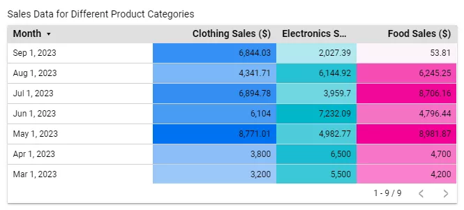
As an example, let’s look at a table of dates and sales. Three columns show sales by category. The color indicates the amount of revenue: the more saturated it is, the higher the profit.
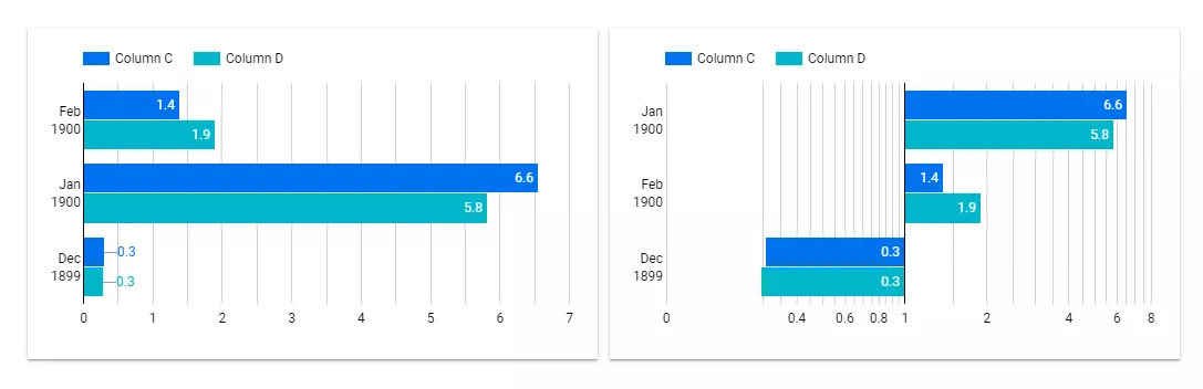
Line graphs and charts
These effectively show relationships between data, time series dynamics, and comparisons of data shares. Use them carefully, as too many charts can lead to information overload.
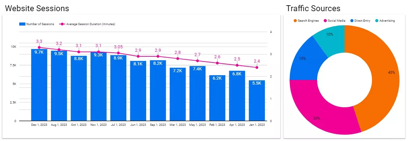
The chart on the left shows the number of sessions on the site (columns) and their average duration (line chart) for the first day of each month. At a glance, you can easily tell that there were 9,700 sessions with an average duration of 3.3 minutes on December 1, 2023.
The pie chart on the right shows the distribution of traffic sources — the percentage of users brought by each traffic source. The chart shows that the most effective source is search engines (45%).
Maps
Maps are perfect for representing geographic data, as well as the location and activity of user groups. However, they become difficult to understand when analyzing large amounts of data.
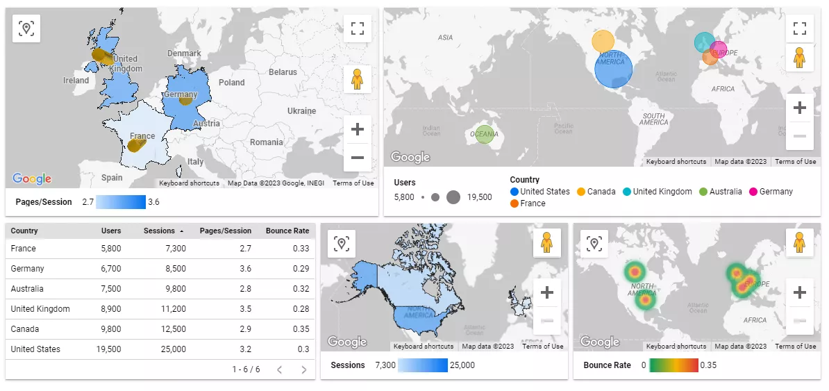
In the lower-left corner, a table of metrics is displayed in different variations on the maps.
- The top map on the left visualizes the number of pages visited per session. The more saturated the region’s color is, the more pages are visited by a user.
- The top cartogram on the right shows the number of users from a particular region; the larger the circle’s diameter, the more users there were.
- The two lower visualizations show the number of sessions by users from a particular region and their bounce rates.
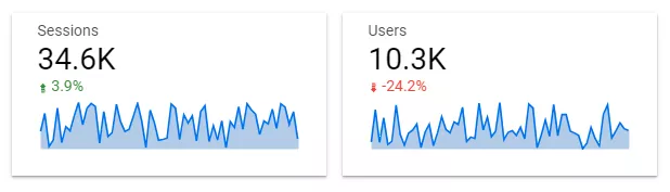
Scoreboard
A scoreboard is a simple and straightforward visualization that displays key numerical indicators. The scoreboard allows you to quickly assess whether the results are in line with your goals. It is limited to showing details and dependencies between indicators.
For example, these scoreboards show the number of sessions and users on the site, the percentage change in this indicator over time, and the dynamics of the change. The number of sessions increased by 3.9%, and the number of users decreased by 24.3%.
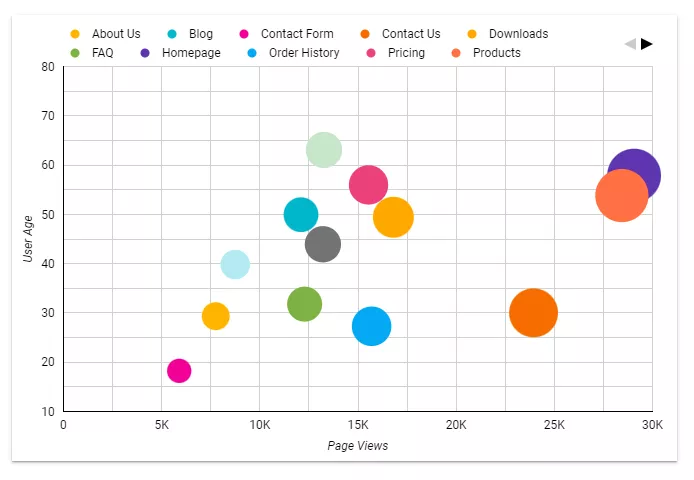
Scatterplot
A scatterplot allows you to identify correlations and dependencies between numerical variables, anomalies, and outliers. It is best used to view a small number of variables simultaneously.
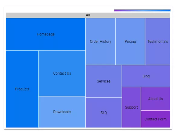
Treemap
A treemap allows you to display data hierarchically to understand the structure and relationships between data elements quickly. It gets confusing with complex hierarchies.
Pitfalls of data visualization
While data visualization is a necessity, there are certain downsides to be aware of. Here are some of the difficulties that arise with data visualization.
1. Distortion of information. Sometimes trying to make a graph beautiful leads to a misunderstanding of the data. Inappropriate scales and colors can confuse.
The left graph shows changes in the data over time. The right graph shows the same data but is misleading because the axes are offset. This technique makes the numbers look more dramatic than they really are.
2. Oversaturation. A large number of elements will make the chart appear cluttered. Keep only the important ones.
3. There are limitations to certain types of data. Text and audio cannot be visualized effectively.
4. Extensive training is needed. The process takes time and requires specific skills.
5. The cost of programs. Visualization tools require a financial investment.
Data visualization best practices
When creating visualizations, aim for a balanced design that combines both information and aesthetics. Here are the steps to creating effective charts.
- Remove unnecessary background elements that have no informational value.
- Eliminate a gray background.
- Avoid unnecessary redundancy. For instance, there’s no need for labels if each column on the axis is already labeled.
- Shorten the title and axis labels if there is enough information about what the graph is showing. An axis that shows a specific time period does not need a “Date” label, as this is intuitive.
- If lines don’t add information, remove them to make the chart clearer.
- Use colors carefully. Choose a few accent colors and link them to context to highlight important data.
- Don’t use three-dimensional elements. Volumes and shadows add no value.
- Remove the grid if it doesn’t add information. If numerical values are shown in the chart, a grid with axes would be an unnecessary duplicate.
- Understand the needs and technical level of the users and produce visualizations that they can easily understand.
- Additional labels can help add detail and context.
A bad example of data visualization
A good example of data visualization
Conclusions
- Visualization makes data more accessible and memorable, allowing you to identify trends and anomalies.
- However, visualization does have certain pitfalls, such as information distortion, element overload, long training times, and high software costs.
- Modern tools like Looker Studio, Microsoft Power BI, and Tableau will transform dry numbers into visual stories. That said, choosing the right tool based on its strengths is crucial.
- Pivot tables, graphs, charts, and more help you see data and look for insights and opportunities for growth. Choosing the right type of graphic is important based on why it is being created.
- To create clear and concise visualizations, avoid unnecessary visual noise, and reduce the number of graphical elements. Color scheme and contrast play an important role in creating graphics that are visually pleasing and easy to understand.
All of this becomes even more effective when backed by professional Business Intelligence & Analytics Services — turning raw data into strategic insights and well-structured visual reports tailored to your business goals.

 3
3
 3
3
 0
0
Recommended theme posts
Related Articles
Display Advertising Effectiveness Analysis: A Comprehensive Approach to Measuring Its Impact
In this article, I will explain why you shouldn’t underestimate display advertising and how to analyze its impact using Google Analytics 4
Generative Engine Optimization: What Businesses Get From Ranking in SearchGPT
Companies that master SearchGPT SEO and generative engine optimization will capture high-intent traffic from users seeking direct, authoritative answers
From Generic to Iconic: 100 Statistics on Amazon Marketing for Fashion Brands
While traditional fashion retailers were still figuring out e-commerce, one company quietly revolutionized how U.S. consumers shop for everything from workout gear to wedding dresses