Why You Need Mockups to Promote Mobile Apps on the App Store and Google Play
The best way to showcase a product is not in an empty space. Rather, demonstrate a product by showing how it works in relation to its intended audience. Web designers have a special tool for this purpose: mockups.
In this article, I will tell you in detail what a mockup is and how to use it in the context of mobile app promotion.
What is a mockup, and what is it used for?
A mockup is a static representation of a product. Its purpose is to show users and stakeholders what a product will look like and how it can be used.
Mockups come in many varieties, and graphic and web designers use them for a wide range of tasks. They are often placed on business cards, mugs, t-shirts, magazines, billboards, laptops, tablets, and smartphones.
Let's discuss mockups for the last two devices in the context of developing graphics for ASO (App Store Optimization).
In the article “Visual ASO: How Images Affect Installations in the App Store and Google Play,” I mentioned that it is better not to use actual screenshots of the app interface to represent a product in the store.
This is where mockups come in. Modern ASO needs mockups to successfully communicate with users and gain their trust.
Here’s why:
- The use of mockups allows you to stand out among your competitors.
- It clearly shows what the app will look like when used.
- It gives more opportunities for the product to be creatively presented.
Therefore, it is important for both designers and ASO specialists to understand mockups.
Types of mockups and which one to choose
The first step to mockup creation is identifying the operating system, whether iOS or Android. This is because the choice of device will depend on the app store for which the graphic is being developed.
If it's the Apple App Store, you should be using an iPhone or iPad. If it is Google Play, go for Samsung or other Android smartphones. If a product is also intended for other types of devices (tablets or smartwatches), you should adapt the graphics to the target market.
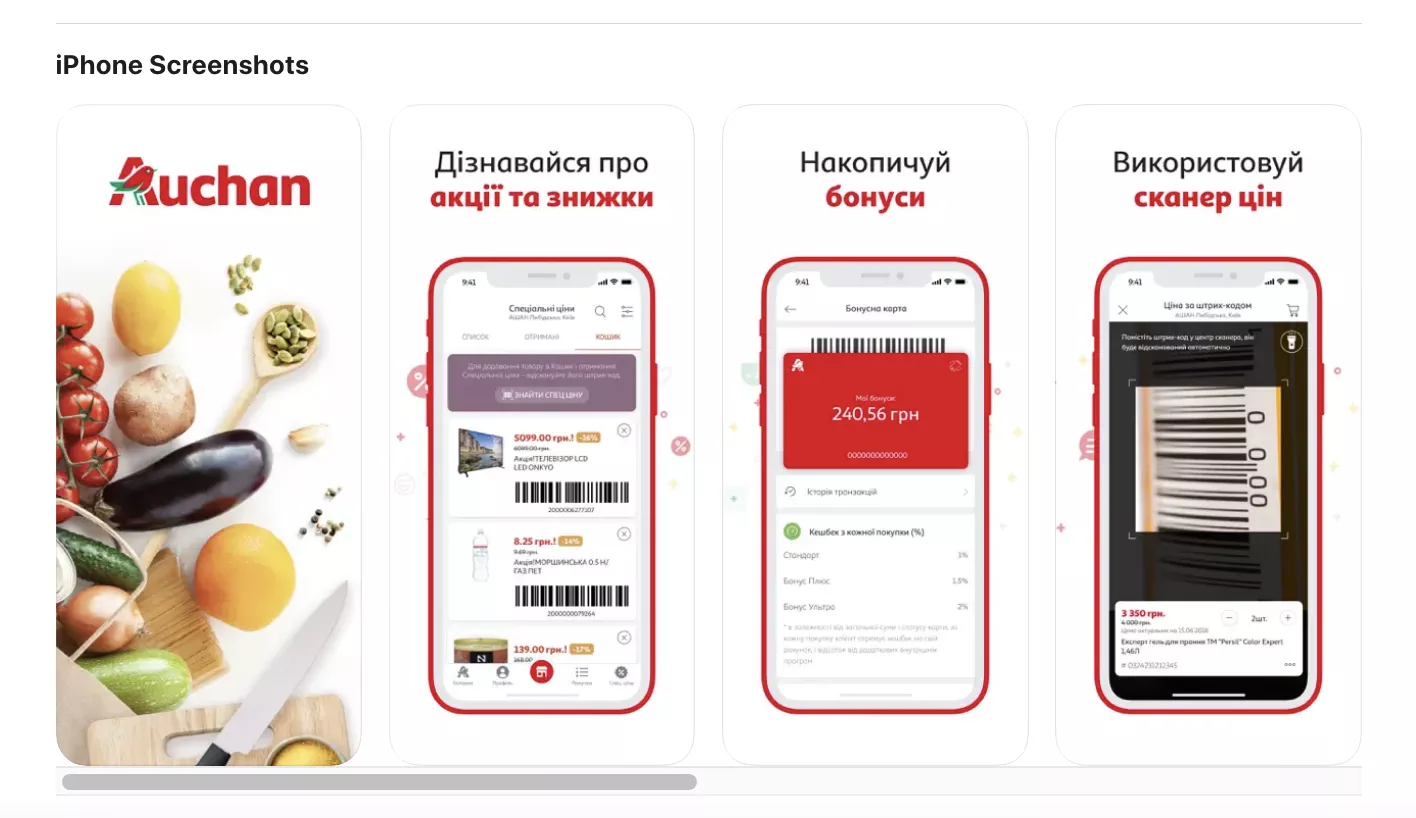
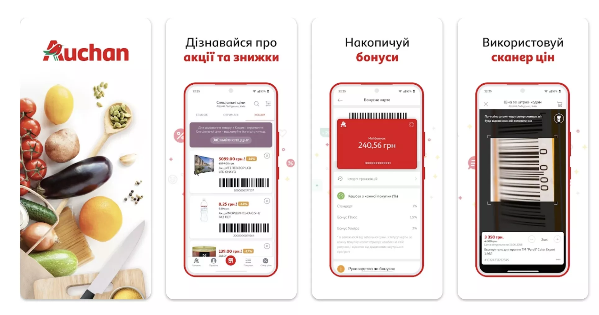
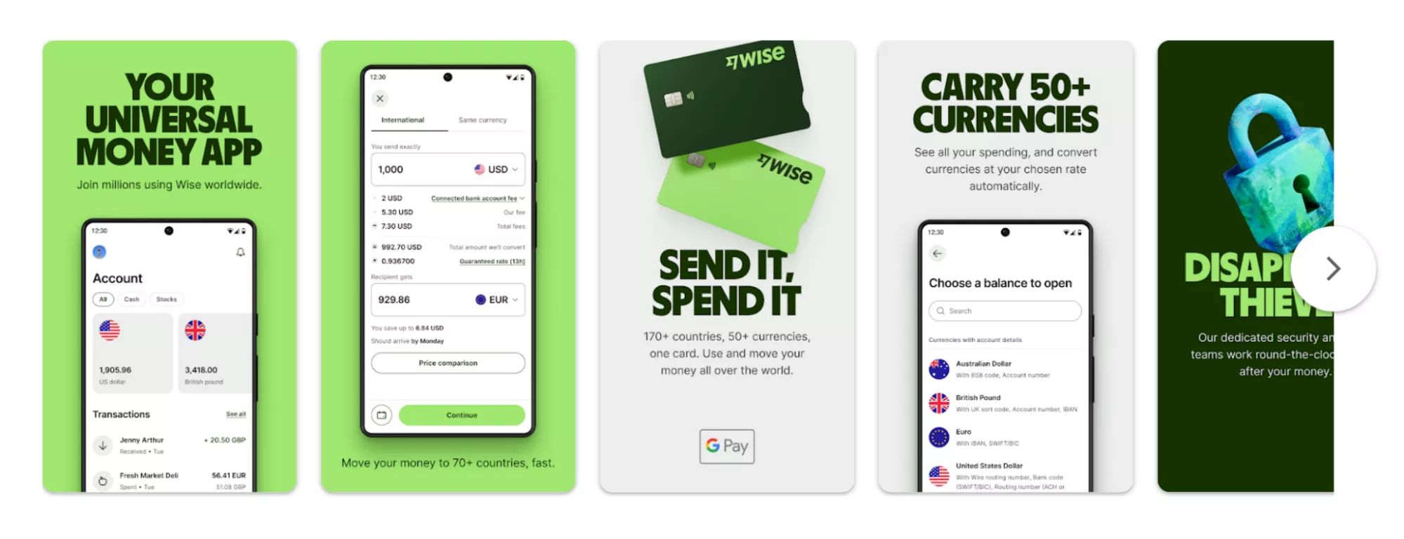
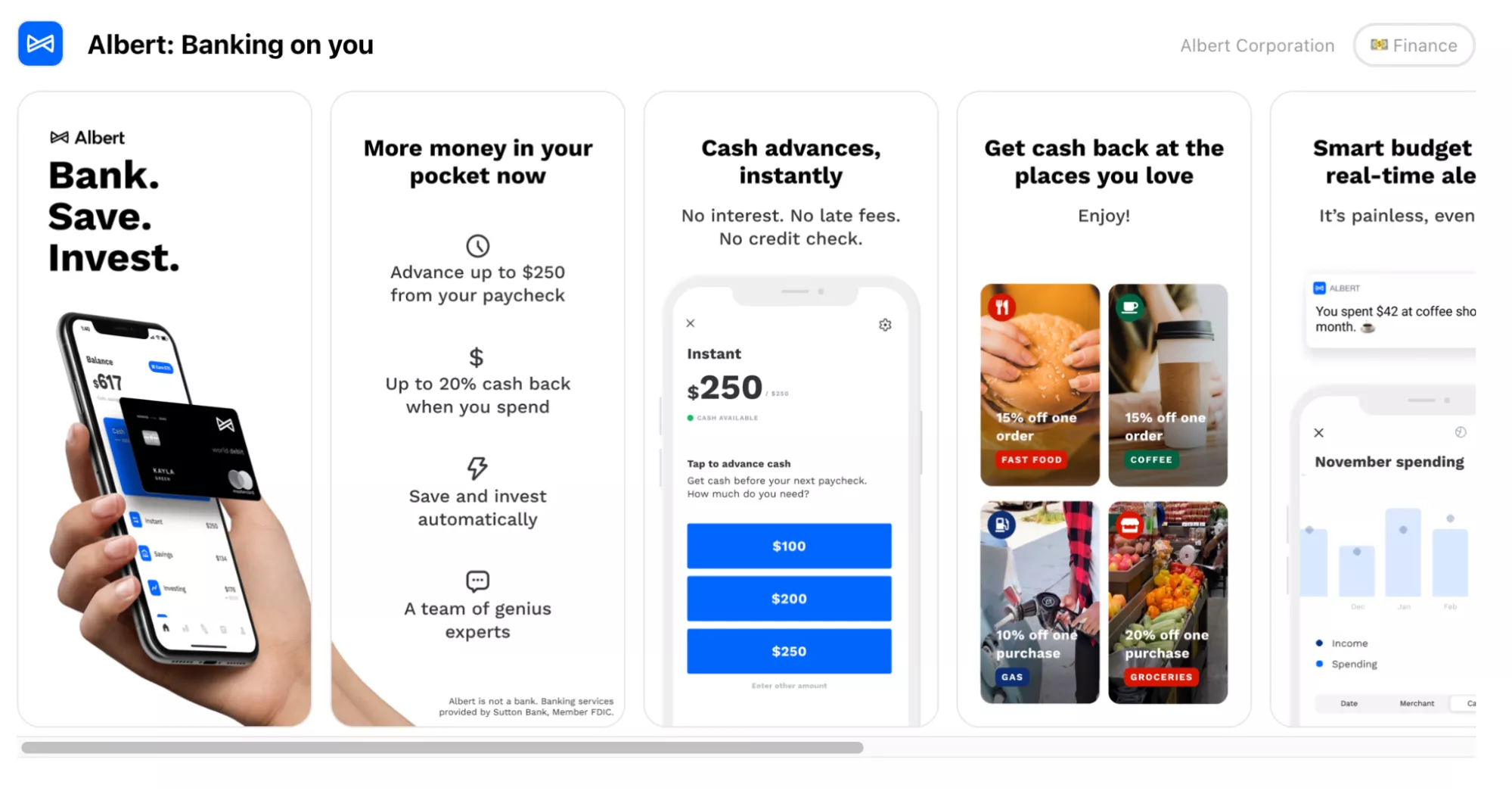
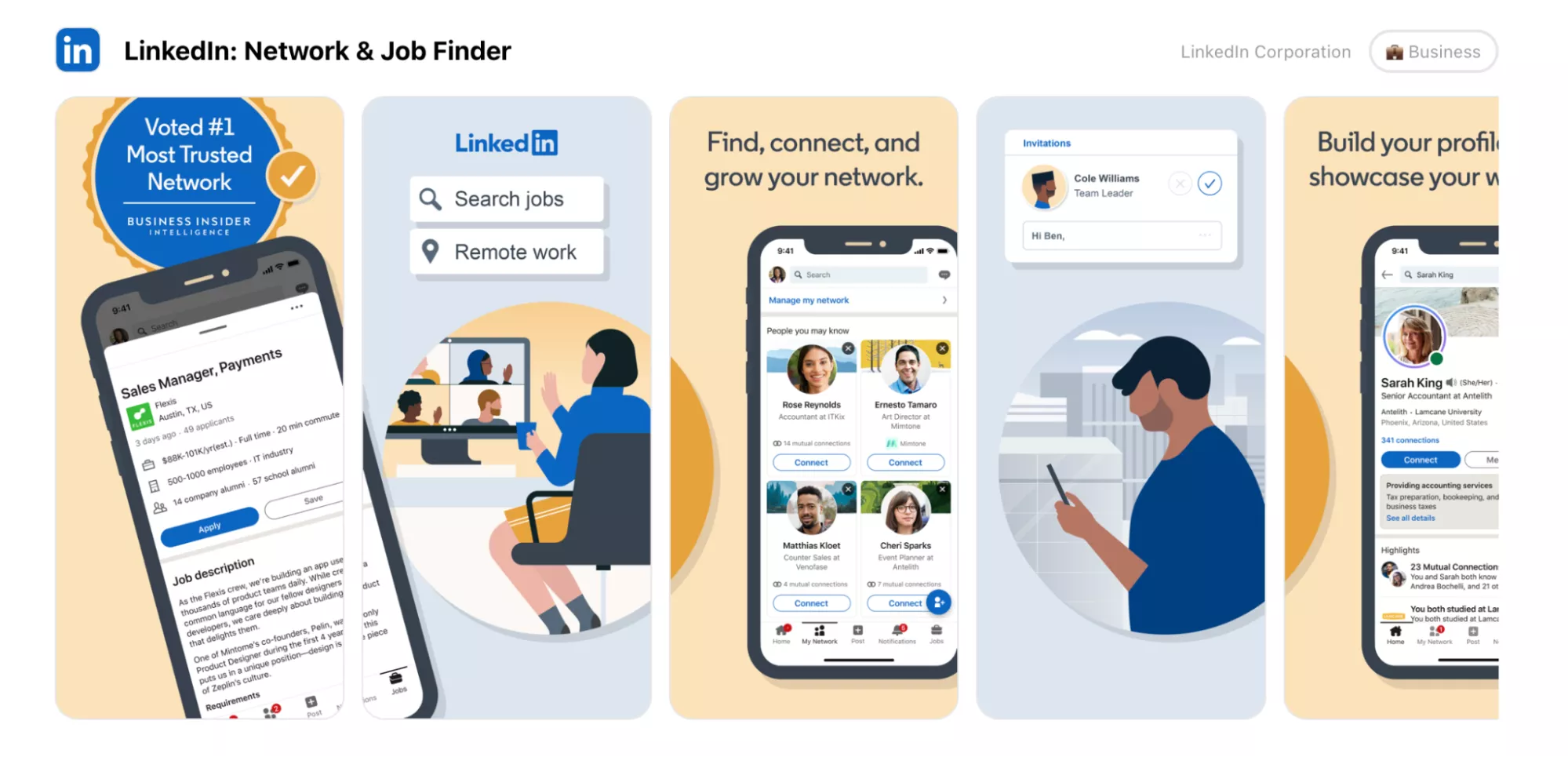
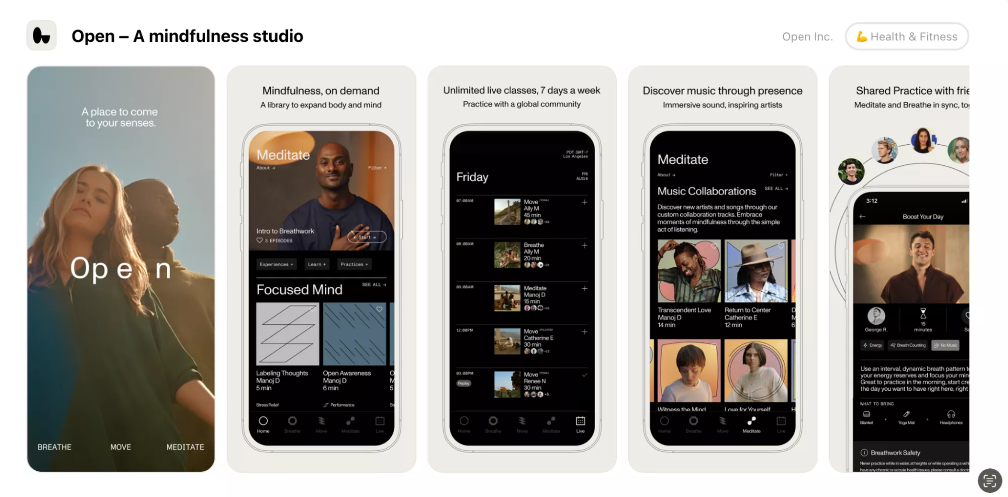
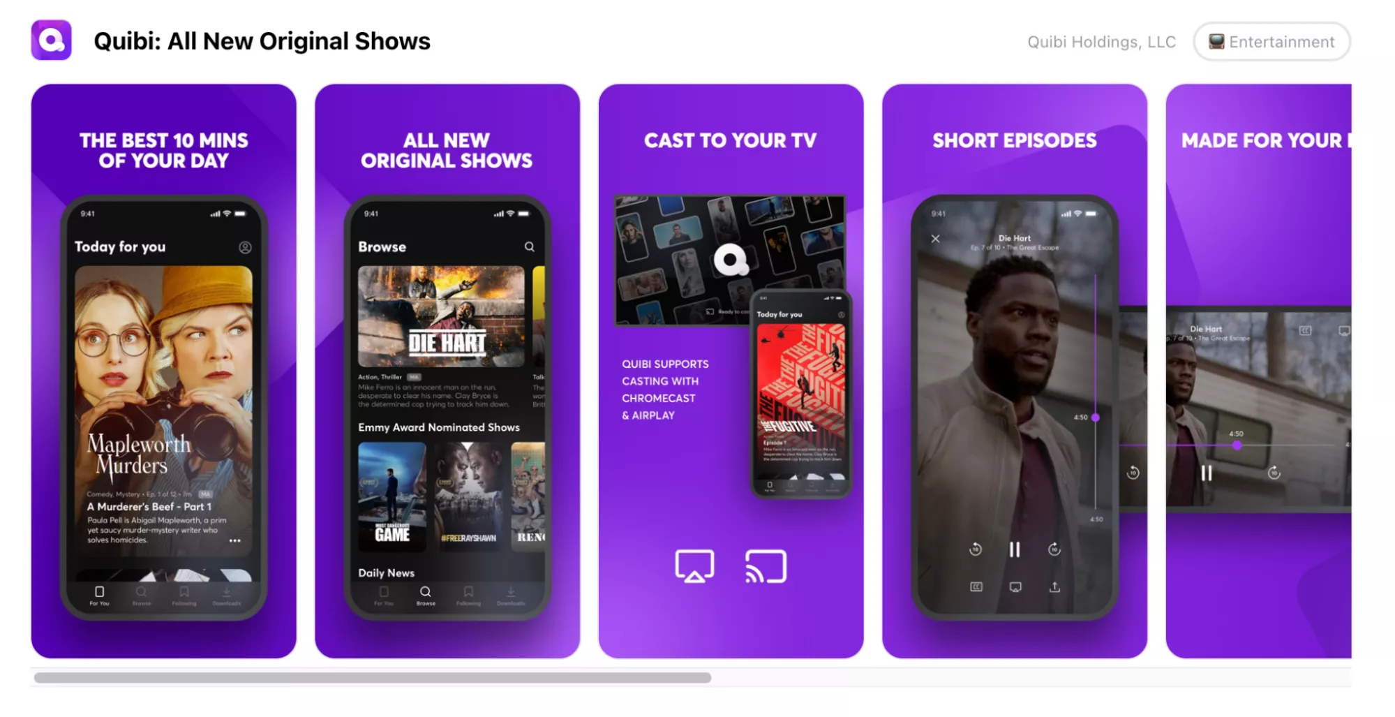
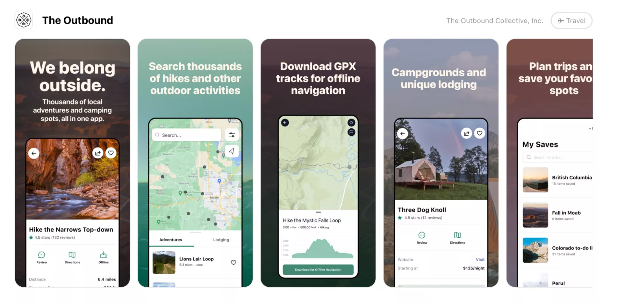
Here is an example of graphics that have been adapted for different markets. The first image shows the App Store and the second image shows Google Play:
The following aspects should be considered when placing a screenshot inside the mockup:
- Android and iOS devices have different interfaces. They have different icons at the top by the camera (time, font, battery icons, internet, presence of a curtain or island, or camera type). iOS devices also allow users to swipe from the bottom to switch between apps.
- The mockup should be done using the latest models of a device. If you promote an application in 2023 with iPhone 14, it will be inappropriate to use screenshots of it on iPhone 8, for example.
Mockups can also be classified according to stylistic principles. Let’s take a look at some of the possibilities with visual examples.
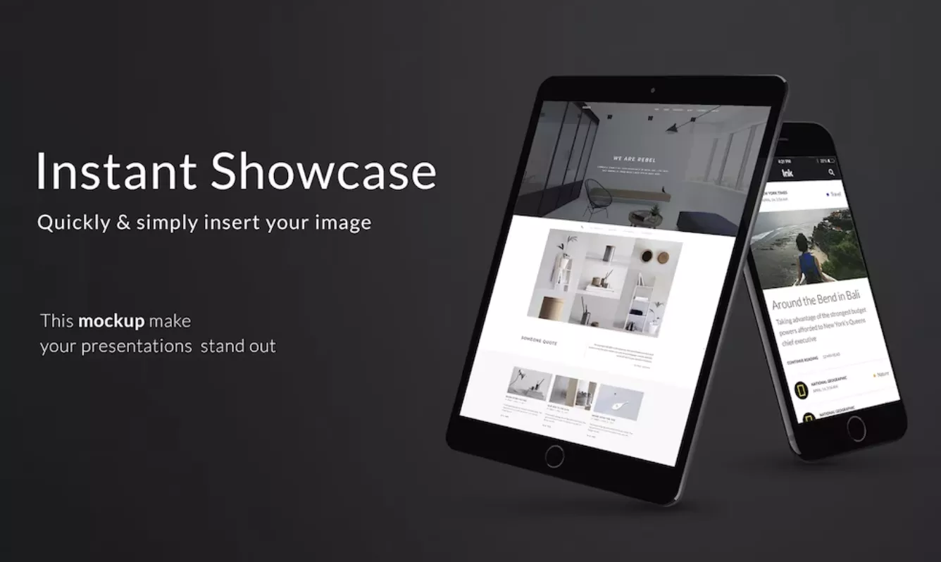
Realistic 3D mockup
In this type of mockup, the device is visualized as close as possible to its real appearance. It lets you clearly illustrate how the application will look on a smartphone and gives you a complex design.
Realistic mockups seem to be the universally preferred choice but note that these types can weigh down the design. This is especially true if the screenshots have dark or patterned backgrounds or if the application's UI is overloaded with information.
Another downside of realistic 3D mockups is that it is not easy to modify them due to their complex design. For example, changing the color once the mockup is done will be difficult.
Realistic mockups often include a screenshot featuring a hand holding a smartphone with the application open on the screen. It is a hyper-realistic technique, but such visuals do not always use real photos. These screenshots can be created using stock images, and the mechanics of using them will be the same as a regular phone screen prototype.
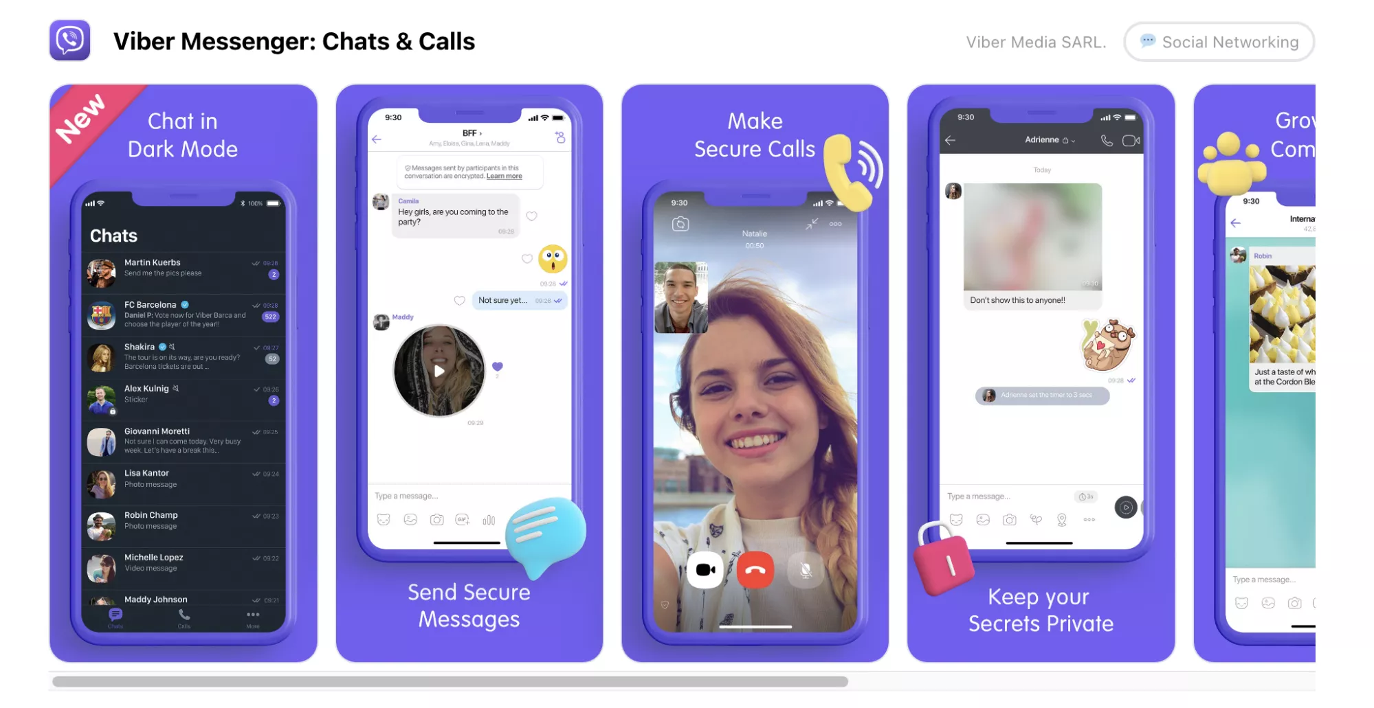
Schematic 3D mockup
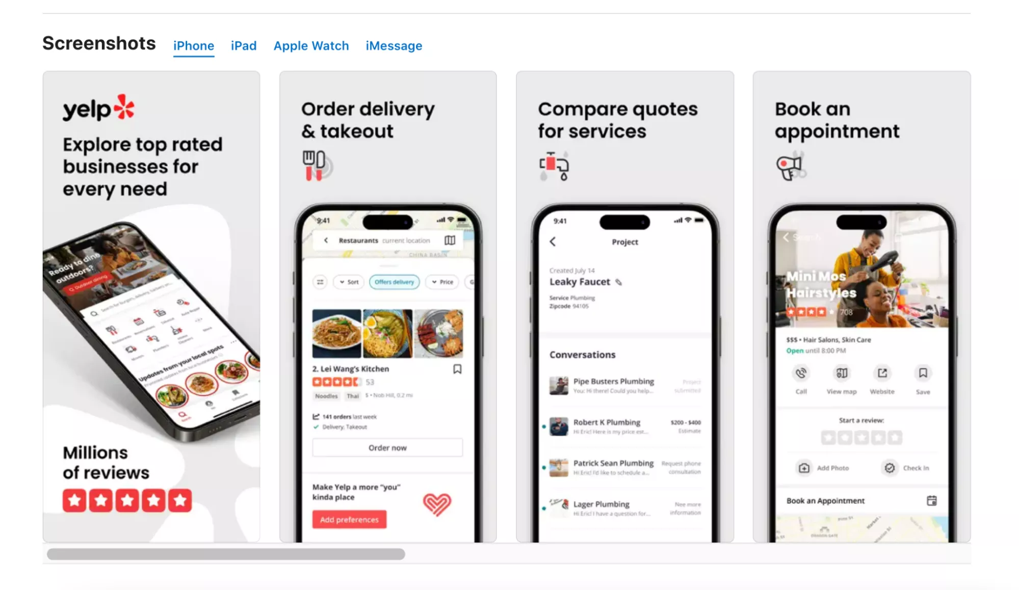
This mockup involves a volumetric prototype of the real device. Unlike the first type, it is more creative and only schematically represents the smartphone.
A schematic 3D mockup is more suitable for bright, playful designs. For example, it can be used by messengers, online stores, gaming platforms, and other mobile products with appropriate brand styling.
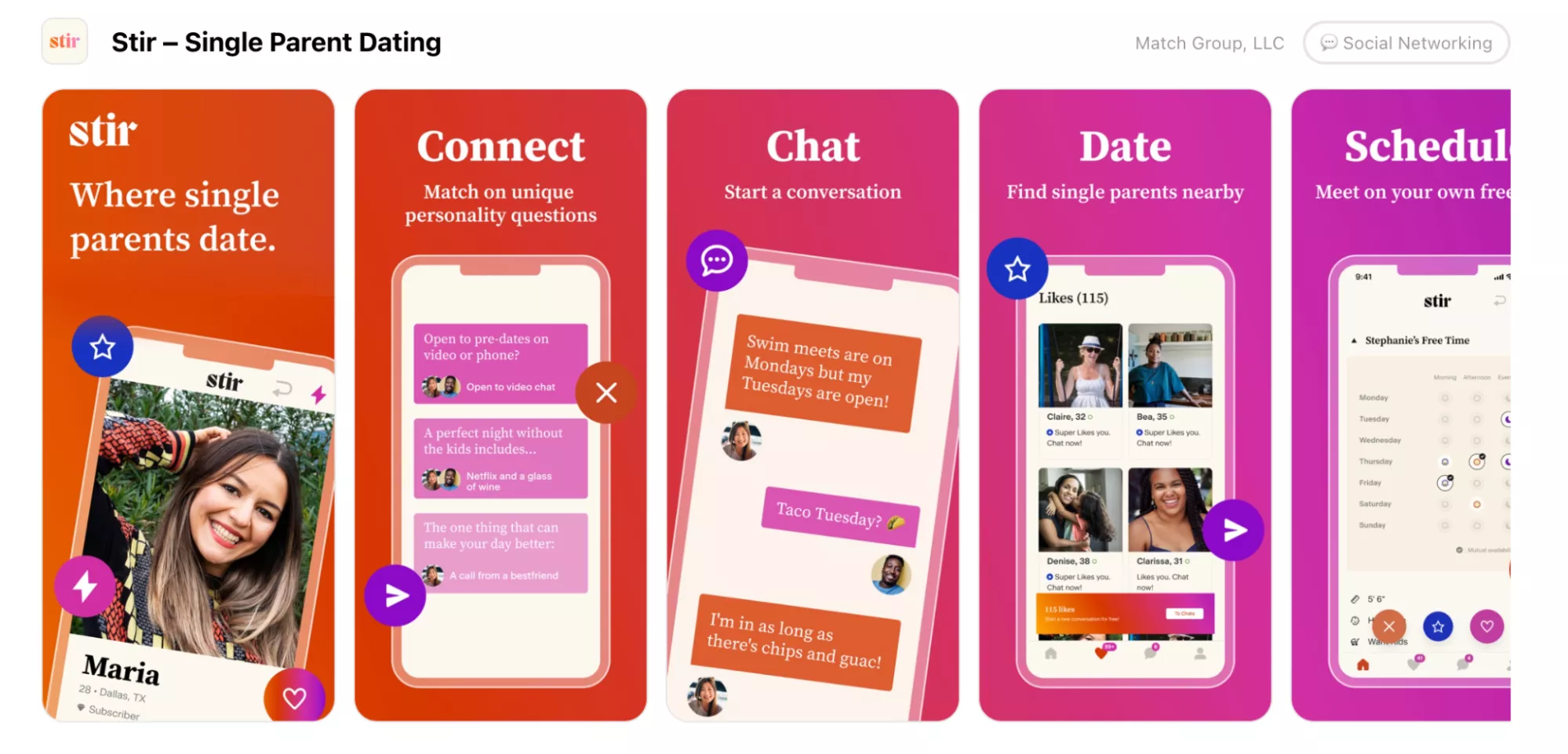
Flat mockup
A flat mockup is a non-volumetric graphical representation of a device. This type of mockup is highly variable because the vector format allows you to easily modify colors, lines, or transparency. Depending on your creativity and the specifics of the application, flat mockups can be styled in any way you like.
Mockup frame
Visually, this is the most different option from a real device. A mockup frame is often used to stylize screenshots and is easy to use. You can easily draw it yourself and adapt it to the style and color scheme of the application to make your content visually appealing. The minimalism and lightness of this mockup will keep the focus on the content of the screenshots.
How to use mockups
Designers often use Photoshop or Figma to develop graphics for their clients.
Photoshop
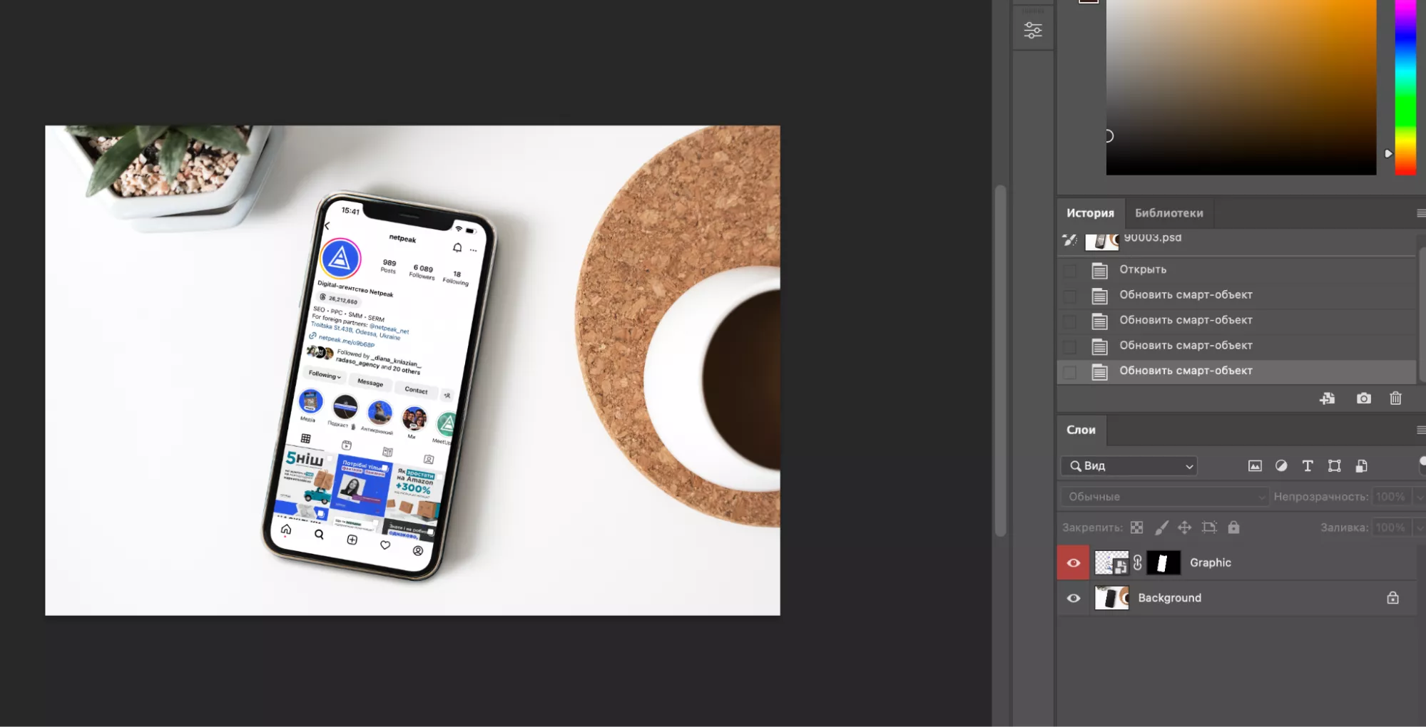
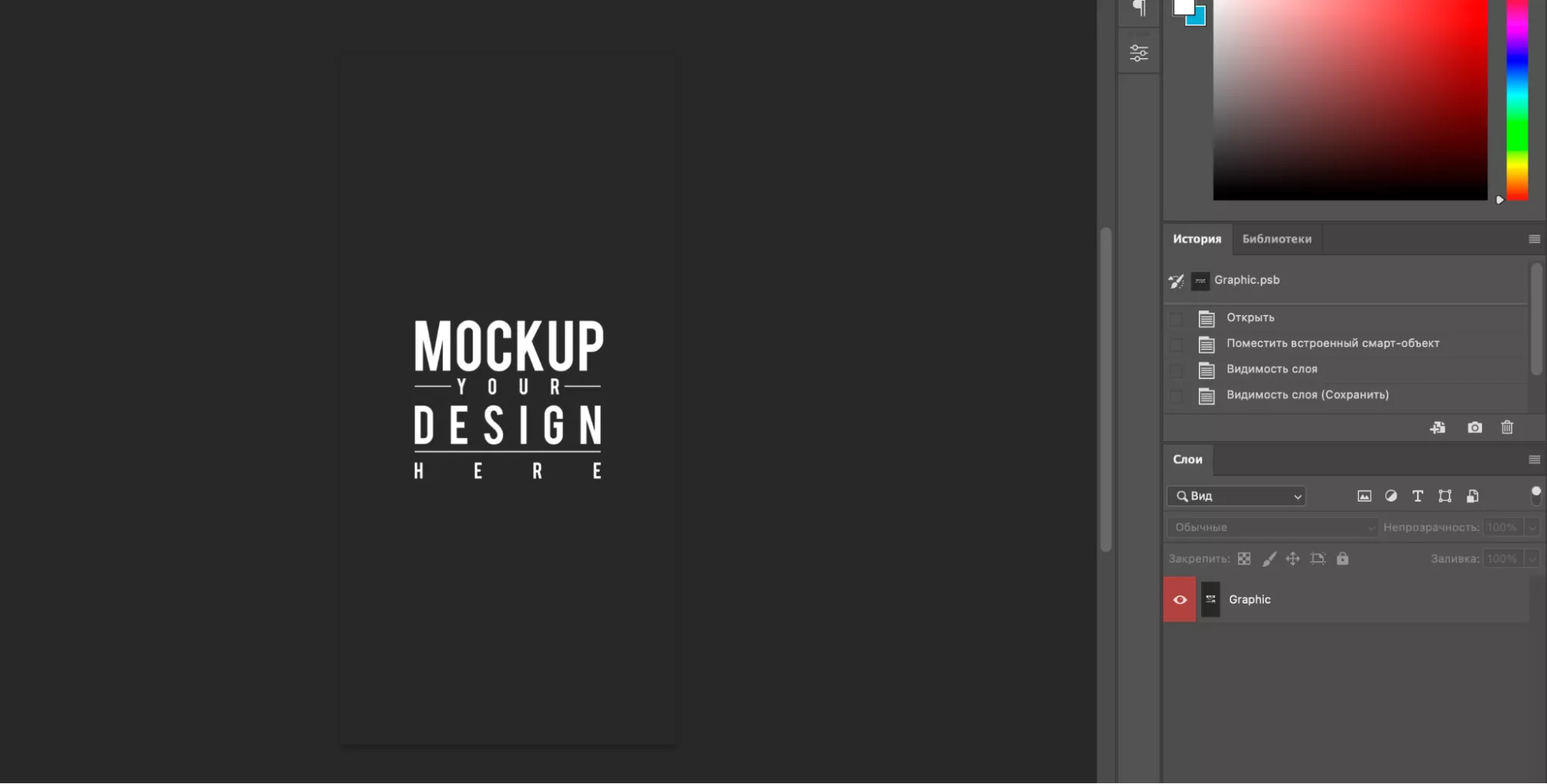
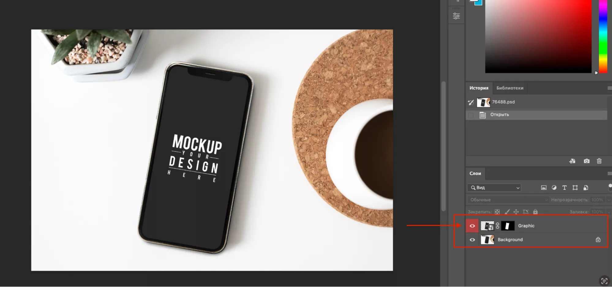
Let’s start by discussing the mechanics of working in Photoshop using the PSD file format. There are several layers in such files and one of these layers corresponds to the device screen. It is a smart object with superimposed effects of light, shadow, and angle of rotation.
Essentially, it looks like this:
Double-click an object layer to open an editable area. This is where the design is added:
A mockup with the desired image is created:
Figma
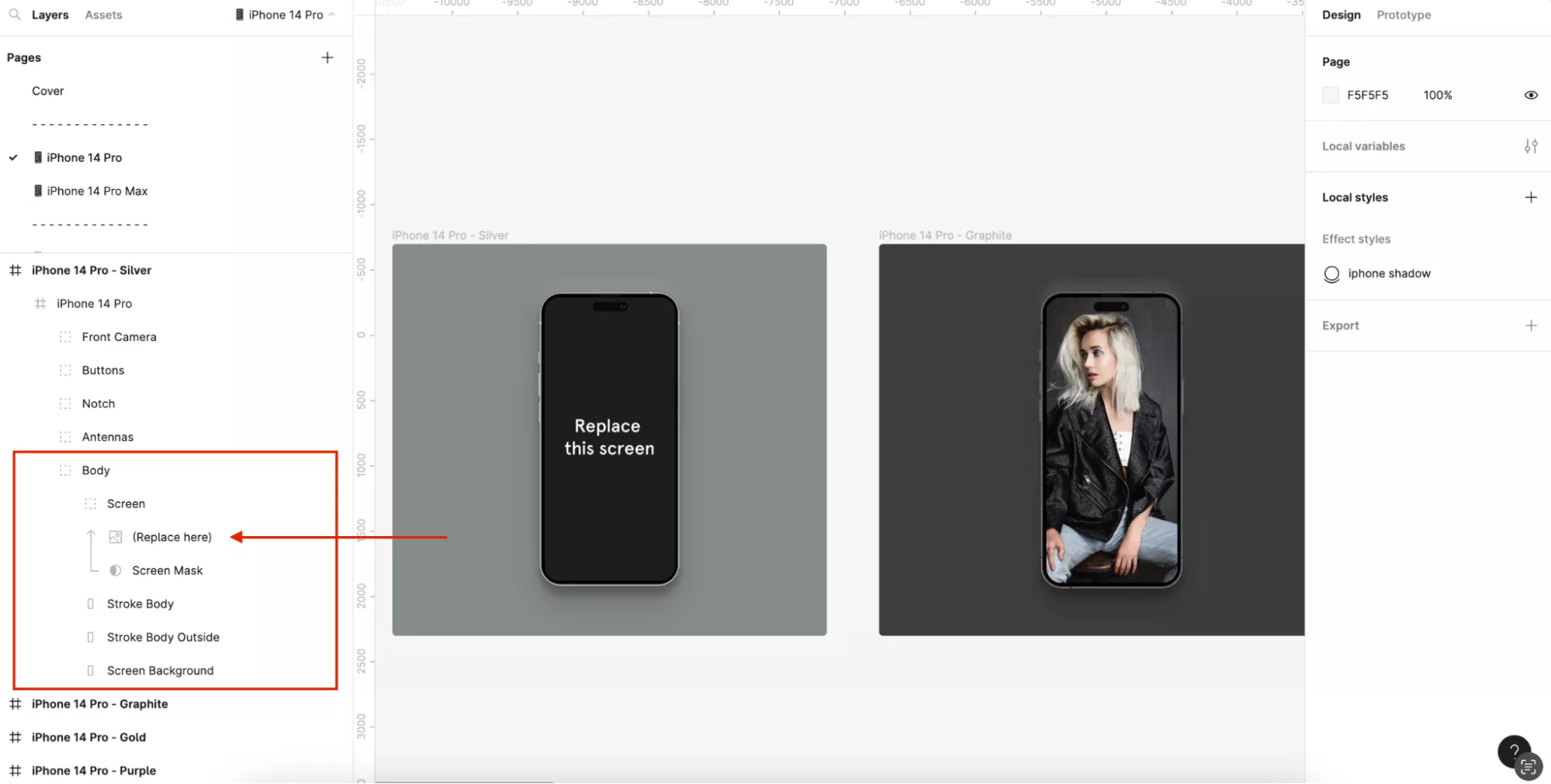
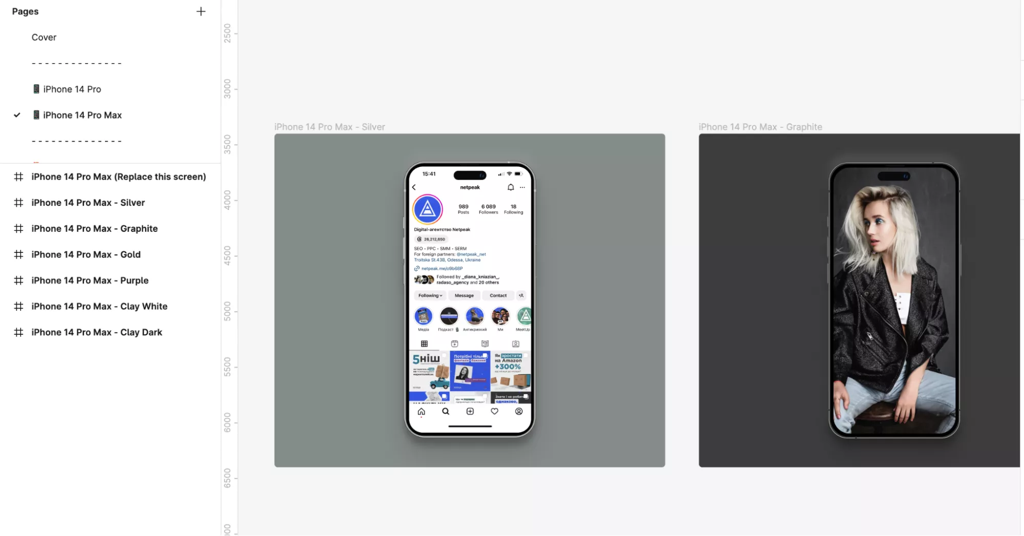
In Figma, mockups can be found within the application, and they have similar editing options. You will work with a layer mask that allows you to embed an image into the mockup screen:
The image is replaced, and you get the visual you want:
Using this method, you can fill the mockup with content. Then, all you have to do is place it on the screenshot and style the whole set.
Where to find mockups
The source material for Photoshop can be found on design exchanges such as Freepik or Mockup-design. If you are designing in Figma, you should check out the Figma Community, where you will find a wide range of models, styles, and colors.
Conclusions
The visual representation of an app on the App Store and Google Play is crucial for its success, and a mockup is an integral part of this. It allows you to demonstrate what the app will look like when it is in use. It also presents the app in a creative manner, making it a great way to stand out from the competition.
When it comes to mockup designs, there are several options to choose from. For instance, there are many different kinds of device prototypes. This allows you to create unique graphics and customize them to fit the interface and niche of the product.
Mockups are just one element of a broader Mobile App Marketing Services strategy that includes ASO, performance campaigns, and user engagement — all working together to ensure your app gets noticed, downloaded, and used.
Related Articles
How to Set Up Consent Mode in GA4 on Your Website with Google Tag Manager
Let's explore how to properly integrate consent mode in GA4, configure it for effective data collection, and at the same time comply with GDPR and other legal regulations
Display Advertising Effectiveness Analysis: A Comprehensive Approach to Measuring Its Impact
In this article, I will explain why you shouldn’t underestimate display advertising and how to analyze its impact using Google Analytics 4
Generative Engine Optimization: What Businesses Get From Ranking in SearchGPT
Companies that master SearchGPT SEO and generative engine optimization will capture high-intent traffic from users seeking direct, authoritative answers

