The client
Zavezu is an online service for transportation and rental of special equipment. The site aims to make the search for a carrier or rental of special equipment simple and fast. Zavezu has brought together transporters and owners of different types of transportation on one platform; these businesses can advertise their services, and users can find a contractor in a few clicks.
Campaign objectives
The client was concerned that the platform was confusing and difficult for users to navigate. They requested a website redesign, although they could not identify the specific elements that were causing difficulties. To find out where to start, we performed a comprehensive analysis of the UX & UI of Zavezu.ua.
Based on the client's needs, we identified the following goals:
- Improve site navigation. Make it clear and convenient for the users (customers looking for carriers).
- Improve the user experience so that more visitors stay on Zavezu.ua and complete their actions (for example, find a carrier or offer their services).
- Optimize the search pages for the main functions. In other words, improve the functionality of pages so that users can find providers or services faster.
- Increase the conversion rate by increasing the number of users who successfully book a carrier or offer their services.
Team strategy
The redesign process began with a client briefing. Together with the Zavezu team, we discussed the site's vision, functional requirements, and key pain points.
Our client had two key audiences, and each had their own specific needs and challenges in the redesign.
- For carriers, it was important to create an interface that would allow them to quickly and efficiently place advertisements for transportation services, conveniently manage logistics, and minimize unnecessary actions on the site.
- The other target group was the customers. They needed a clear design with a focus on convenient search and ordering of transport services. They value easy navigation, clear processes, and easy-to-use mobile versions of the site.
Each audience required a unique approach to optimizing the UX and the UI.
User experience and competitor analysis
1. Using the Microsoft Clarity tool, we studied user behavior on the site. The service provides heatmaps and records of website visit sessions. Their analysis helped us to understand how users interact with Zavezu.ua, which elements on the pages (buttons, images, navigation) attract the most attention, and where navigation problems occur.
2. To better understand market standards and expectations, we analyzed competitors in the niche.
3. The data from Google Analytics 4 helped us identify specific problems, such as high bounce rates on certain pages and low time spent on the site. This allowed us to pinpoint problem areas and determine which pages to focus on.
Navigation and interface on the main page
The highest priority pages to work on were the home page and the carrier page. Both required significant changes due to unclear navigation, overload, and structure. At the same time, the carrier page and the home page had the highest user traffic at ~52% and ~10%, respectively.
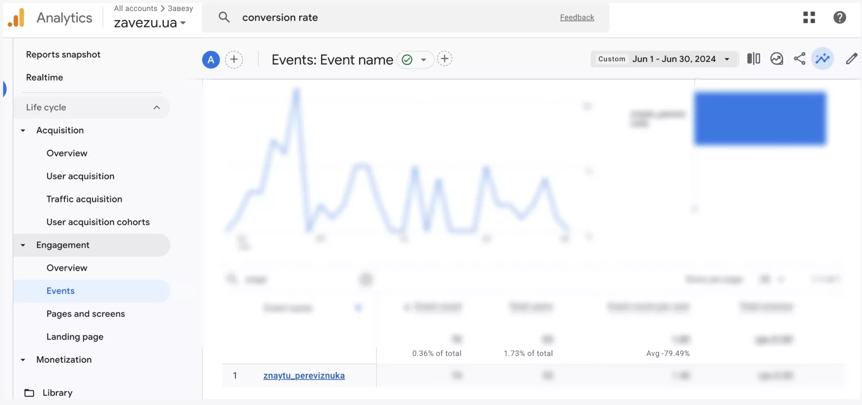
The main challenge was that users could not find the information they were looking for, with the “Find a carrier” button being used by only ~1.73% of users.
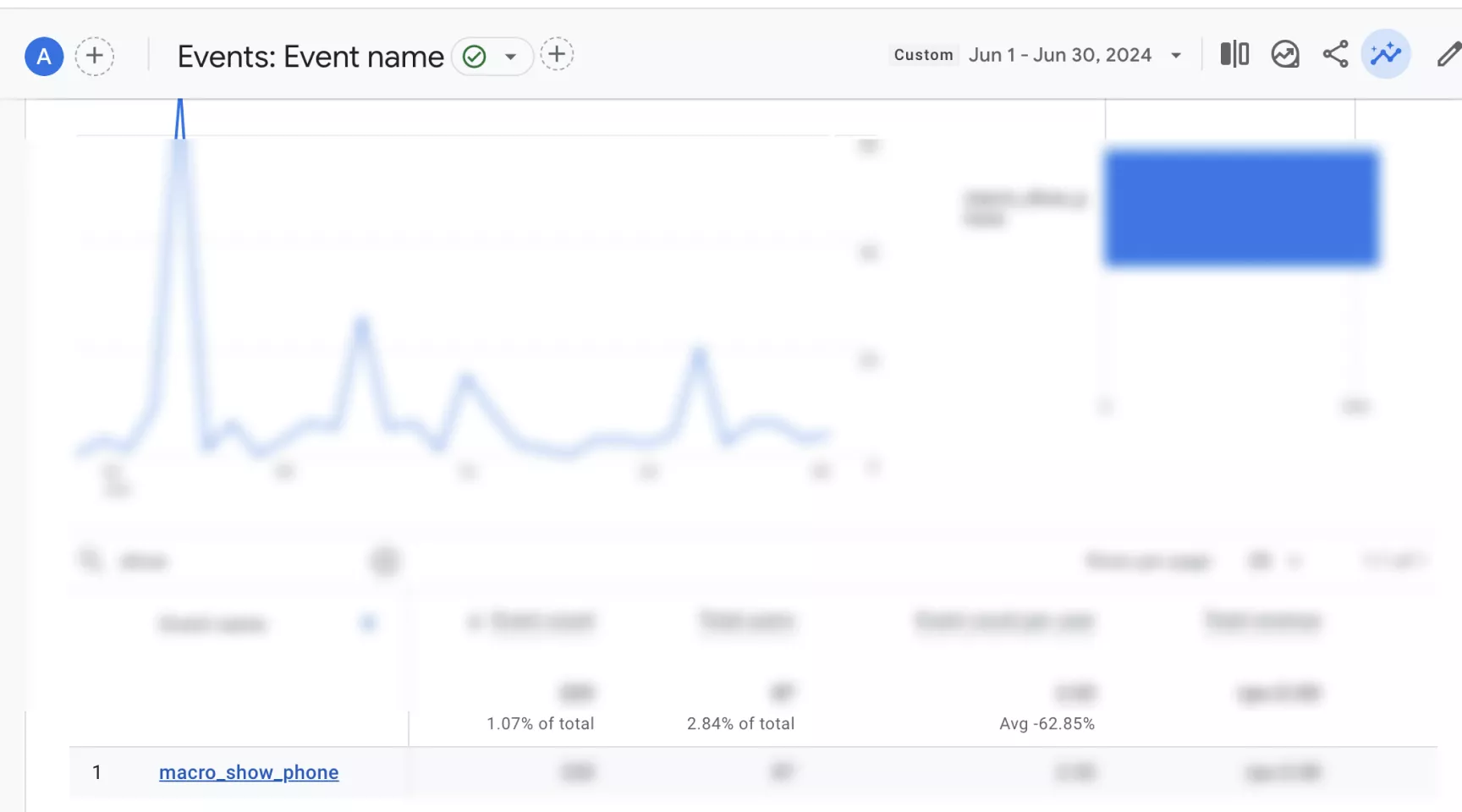
Only 2.84% used the website's main call-to-action, “Show carrier number”.
Confusing navigation and visual structure
According to one month of Google Analytics 4 data, this contributed to a high bounce rate of ~55% and a User Key Event Rate (the rate at which a purchase or order is made) of ~10.9%.
Incorrect use of color and unstructured design
There was a mismatch of colors and no clear hierarchy of elements, resulting in chaos.
Hierarchy is the use of elements at different levels according to their importance. This helps to focus the user's attention on the most important things. For example, headings can be customized with H1, H2, and H3 formatting. In the design, you can use contrast, colors, font sizes, or the arrangement of elements to draw attention to the most important calls to action, such as buttons, forms, or important messages.
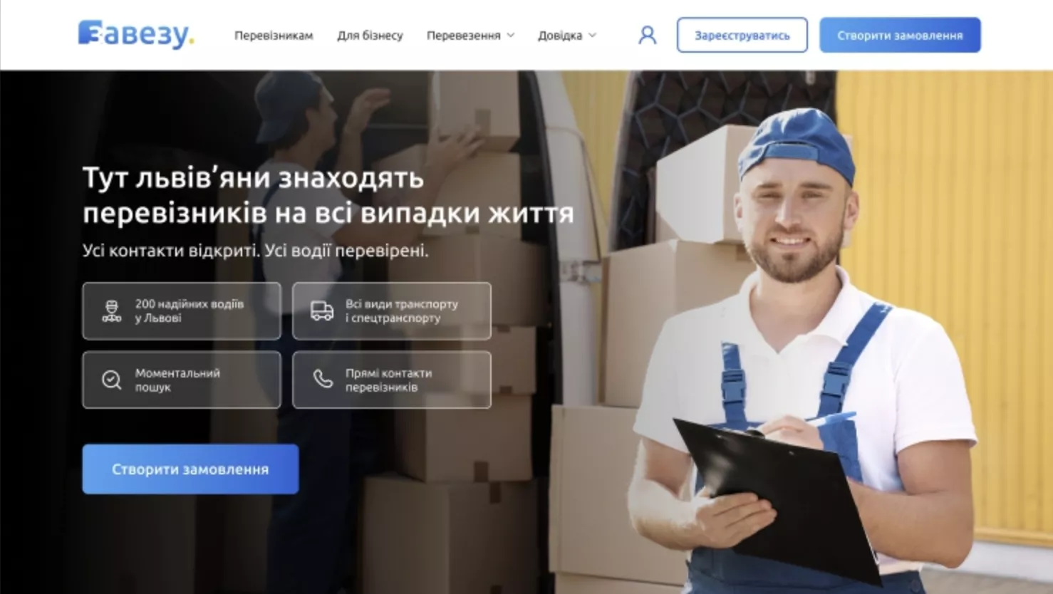
Let's take a look at the main buttons on the site's home page.
They perform different actions but have no priority. This is not correct.
Both buttons are colored, so they are considered primary. From a website interface design perspective, this is a mistake. If one was filled (primary) and the other was not filled with a line (secondary), the user would notice the filled one first. This prioritization allows you to highlight the call to action and emphasize the main action.
Lack of basic functionality on the main page
The search field incorrectly displayed the results and redirected to the carrier catalog page regardless of the request because only the “Find a carrier” button worked.
This affected macro conversions such as order creation and carrier search.
Not only that, the user had to use two clicks to view the phone number on the catalog page. According to Google Analytics data for June 2024, the number was viewed by only 2.84%.
Redesign solution
1. We used contrasting colors to highlight important elements and streamlined the structure. This helped users quickly find the information they needed and easily engage with the CTAs. After the redesign, we simplified the home page by presenting the benefits in a concise way and added the main “Create order” button.
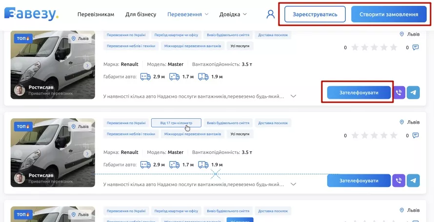
2. Each page was customized to a single style. This made it easier for users to navigate the site. We also used color accents to highlight the key actions that drive conversion: “Call”, “Create order”, and “Register”. These elements are now instantly recognizable, making it much easier for users to take targeted action. We also added the “Carrier catalog” option.
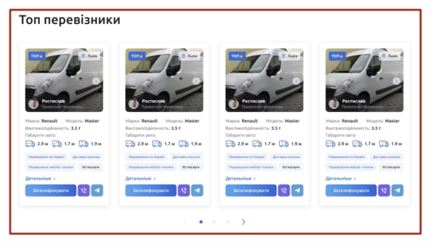
3. After discussion with the client, we introduced additional monetization possibilities by adding a “Top carriers” category in the catalog. To get to the top of the ads, carriers will pay extra to the site.
Simplifying the process of creating an order
When we first took on the project, most website pages were similar in functionality. This made the site difficult to navigate and degraded the user experience. The pages also had filters that were not applied at the same time. This confused users and caused them to leave the site.
Creating an order was too complicated and time-consuming, which reduced the conversion rate. According to analytics data, only 4.7% of users who started the order process completed it.
1. We reduced the amount of information on the home page and made the carrier catalog the main functionality.
2. On the service pages, we shifted the focus to maps with carriers. We improved them visually: we adjusted the text in the buttons to speed up the one-click ordering process and changed the location, the photo, and the carrier company.
3. We also fixed the functionality of filters, as only the one selected by the user was working. Now, you can select several filters and filter the page according to your needs.
4. We then streamlined the application form by reducing the number of fields and simplifying the application process.
Results and business insights
Using specific performance tools and indicators, we could clearly identify both the design elements that needed optimization and different ways to measure the effects of our changes. The latter includes evaluating micro-conversions and loading speeds.
Using micro-conversions
In Google Analytics, we set up micro-conversions to track intermediate user actions, such as views of important pages, clicks on the “Order” button, and other key interactions. This allowed us to analyze how well the steps to the main conversion were set up and find areas where users might stop or encounter difficulties.
Improving loading speed
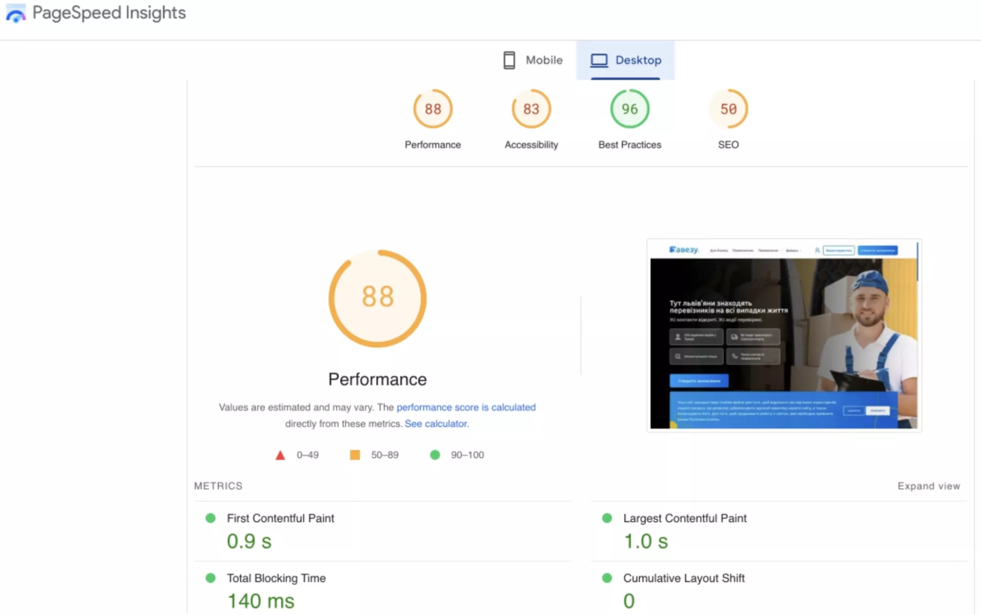
We also used page speed reports from Google Analytics and Google PageSpeed Insights. This was useful for optimizing page load times on mobile devices, which had a positive impact on user retention and reduced bounce rates.
As a result of the UX improvements, our client achieved their business goals, including increasing conversion rates and boosting revenue.
- UX optimization has contributed to a more efficient user experience. By improving navigation, simplifying the order form, and improving page load speed, we made it easier for site visitors. Users can now find the information they need more quickly, and they will find it easier to fill out a form and search for carriers.
- The increase in conversions and the ease of the ordering process led to an increase in overall revenue. We expect the improved UX to continue to reduce bounce rates and drive more subscriptions from carriers.
Feedback on cooperation
Yulia Turchyn, Founder of zavezu.ua
It was very convenient to work with the Netpeak Ukraine team. The specialists are quick and easy to communicate with, we found a common language, and our request was completed. It's not the first time we've come back to Netpeak for additional services or projects.
Danylo Minin, Head of Usability Department at Netpeak Ukraine
I would like to express my deep gratitude to Oleh and Yulia for their trust in the Netpeak Ukraine team. We are very happy to have the opportunity to work on such an interesting project where we were given complete freedom. The zavezu.ua team's openness to new ideas and active participation at all stages made the cooperation extremely productive. I would also like to thank UX specialist Kateryna and UI designer Anna for their creativity and professionalism. Thanks to their efforts, we were able to achieve great results.
Related Articles
Display Advertising Effectiveness Analysis: A Comprehensive Approach to Measuring Its Impact
In this article, I will explain why you shouldn’t underestimate display advertising and how to analyze its impact using Google Analytics 4
Generative Engine Optimization: What Businesses Get From Ranking in SearchGPT
Companies that master SearchGPT SEO and generative engine optimization will capture high-intent traffic from users seeking direct, authoritative answers
From Generic to Iconic: 100 Statistics on Amazon Marketing for Fashion Brands
While traditional fashion retailers were still figuring out e-commerce, one company quietly revolutionized how U.S. consumers shop for everything from workout gear to wedding dresses


