Visual ASO: How Images Affect the Number of Installs on the App Store and Google Play
No matter how engaging and useful your app is, users will not know about it until they download it. But how do you get a potential user to choose your app among the many competitor apps out there? The key is to make your app noticeable. In this article, I will tell you about the visual component of your app and how to enhance it to stand out from other apps.
Icons and screenshots: why they matter
One main factor influencing a user’s decision to download an app is the graphics and visual presentation of the application in the App Store and Google Play. When searching for an application, the first elements a user looks at are the icons and screenshots. Within a few seconds, they need to be convinced to click the install button.
The icon is the main element of an application's identity; it is essentially a thumbnail of its branded part.
The icon is displayed in the App Store or Google Play search engine, on the application page, and directly in the smartphone menu after the application is installed.
The screenshots are images of the app's main features placed on its page to show a potential user the main benefits and interface of the mobile product.
To encourage the user to install the app, the graphics must be not only visually appealing and attractive but also structured and responsive to the logic of the application and stores.
Basic recommendations for optimizing graphic elements in the App Store and Google Play
The visual presentation of the app can significantly help increase its conversion rate. To improve the visuals, you should take into account certain indicators.
Technical compliance
In order for your graphics to be eligible for publication on app distribution platforms, they must be technically compliant with the standards set by the App Store and Google Play. These include screenshots and icon sizes, device resizing, content that can be published, and the number of images allowed in a screenshot network. You can familiarize yourself with the store requirements by following these links:
The icon (the key to brand recognition)
The icon is the main element of mobile app recognition. It should be concise and functional to reflect the essence of the application while still being attractive enough to gain the attention of a potential user.
There is no single graphic template for creating an icon. Depending on the type of application, you can approach the visual design of the icon in different ways:
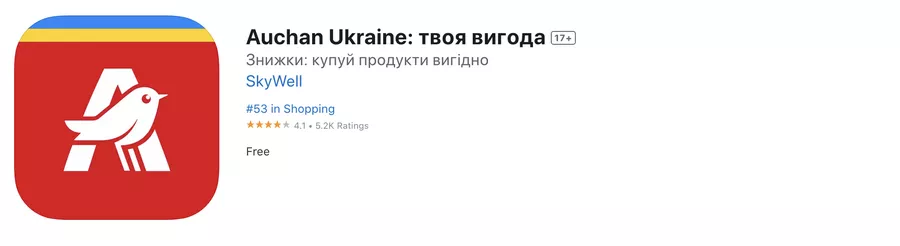
1. If it is a large and recognizable brand, such as Auchan or LinkedIn, you may want to use a logo or identity elements for the icon.

2. For lesser-known brands, such as those without a website, you can draw the graphics yourself based on the app functionality and theme.


3. Gaming applications often use gameplay elements or characters as part of their visuals.


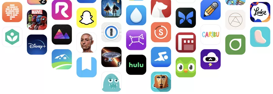
Graphics consistency
The visual part of the screenshots has as much influence on the user as the icon. It is important to stylistically combine the icon and screenshots in the graphic design process. They should complement each other and be consistent with the application interface. Visual elements in the marketplace should be made in the same color scheme and style, considering the peculiarities of the product niche and its target audience.
This contributes to consistency and enhances the integrity of the app's presentation in the marketplace.
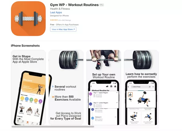
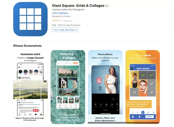
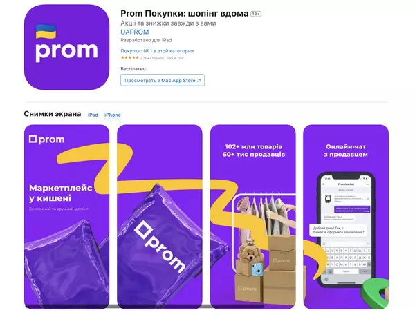
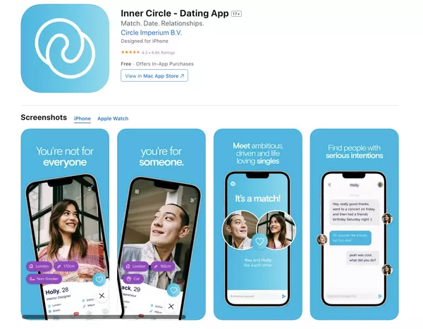
Here are some examples of high-quality graphics:
Analyze your competitors
To be successful, it's important to stand out and be more visually appealing than similar products. Therefore, it's important to understand the market and design trends in your product niche. Before you render graphics, analyze how your competitors present their apps, what key points they emphasize, and what logic guides them. Scroll through popular apps or research apps in your category, and try to see if there are ideas that can be borrowed and improved.
Common mistakes when designing graphics for screenshots
There are some common issues that can negatively affect the appearance of screenshots.
- Small, illegible text.
- No highlighting of keywords or features.
- Placing actual screenshots of the app instead of creating a design presentation.
- Using screenshots of an outdated app version.
- Selecting screenshots that do not reflect the essence and functions of the app.
- Poorly edited graphic material.
See the examples of poor-quality graphic work below.
- Dark gray text on a light background would have been readable if the designer had followed typography rules. The incorrect line spacing makes it look "stuck in" and renders the message and especially the keywords illegible.
- There is a poor-quality mocap break on the first and second screenshots. The images do not match up correctly.
- The image of the weightlifter hangs in the air and has illogical shadows, as does the layout in general.
- Zoom (zooming in on key information in a screenshot) is stylistically inconsistent with the application interface.
- The icon does not complement the screenshots, and the overall picture does not seem coherent.
This example has the same problems as the first one: a lack of visual connection between the icon and screenshots, poor text handling, and incorrect mocap display. In addition, each screenshot has a new background, which makes it even more confusing. Mocaps should be the same size and color, and there should be less text. Additionally, the text should be of a readable size, and the background should be the same across the whole series of screenshots and contrast well with the text.
Uniqueness and value first
According to the technical requirements, ten screenshots can be placed in the App Store and up to eight screenshots in Google Play. However, users only see the first three screenshots in the store search engine. These three screenshots should be appealing enough to convince them to open the app description and scroll through the entire set of screenshots. That's why the graphics on the first three screenshots should be bright, eye-catching, and reflect the main and unique features of the application. It is necessary to convey to the target audience the benefits they will get from using your product. Here are some examples:
Conclusions
The icons and screenshots of an app on the App Store or Google Play are the main quality indicators of a mobile app's visual presentation. To develop structured and consistent graphics, ensure that:
- the technical standards of the stores are met;
- the graphics are in line with current trends in the niche;
- the advantages of the product are highlighted;
- icons, screenshots, and application interface are in the same style;
- market research has been conducted.
By following the above list, you will enhance the visual component of the application and, as a result, increase the install rate of your app.
To make informed design decisions and stand out in a competitive landscape, consider using Mobile App Market Research Services — we provide valuable insights into user expectations, competitor benchmarks, and visual trends in your app category.

 3
3
 2
2
 0
0
Related Articles
How to Set Up Consent Mode in GA4 on Your Website with Google Tag Manager
Let's explore how to properly integrate consent mode in GA4, configure it for effective data collection, and at the same time comply with GDPR and other legal regulations
Display Advertising Effectiveness Analysis: A Comprehensive Approach to Measuring Its Impact
In this article, I will explain why you shouldn’t underestimate display advertising and how to analyze its impact using Google Analytics 4
Generative Engine Optimization: What Businesses Get From Ranking in SearchGPT
Companies that master SearchGPT SEO and generative engine optimization will capture high-intent traffic from users seeking direct, authoritative answers