Look around, it’s long past April 2015 when Google began focusing more on mobile devices with its mobile-friendly update. Over the past nine years, the landscape of internet use has dramatically shifted, with more people using smartphones to access their favorite websites.
Today, anyone involved with the web – whether SEO specialists, developers, or business owners – must understand the concept of mobile-first indexing. It is crucial to remain competitive and establish a strong presence in the SERPs.
This article will equip you with the latest insights about mobile indexing from an SEO perspective. Stay with me and learn all you need to know about mobile-first indexing.
- What is Mobile-First Indexing?
- Why Did it Happen? Mobile-First Statistics
- Google’s Mobile-First Indexing Timeline
- 3 Mobile-First Index Configurations
- How to Do Mobile-First Indexing?
- How to Fix Common Mobile-First Index Problems?
- FAQ
What is Mobile-First Indexing?
Mobile-first indexing is when Google predominantly uses the mobile version of a website’s content for indexing and ranking.
Google has 11 common crawlers in its arsenal that it uses to crawl your site. Among them, the two primary ones are the Smartphone and Desktop crawlers. Based on the Google Search Console (GSC) data for 20 sites, I compared the crawl stats by Googlebot type. Here is the comparison:
|
Site, № |
Smartphone, % |
Desktop, % |
Is the Smartphone crawler more common than the Desktop crawler? |
|
1 |
44 |
29 |
✅ |
|
2 |
39 |
5 |
✅ |
|
3 |
56 |
6 |
✅ |
|
4 |
61 |
38 |
✅ |
|
5 |
16 |
8 |
✅ |
|
6 |
50 |
24 |
✅ |
|
7 |
15 |
27 |
❌ |
|
8 |
30 |
6 |
✅ |
|
9 |
18 |
13 |
✅ |
|
10 |
37 |
35 |
✅ |
|
11 |
53 |
26 |
✅ |
|
12 |
32 |
1 |
✅ |
|
13 |
24 |
13 |
✅ |
|
14 |
21 |
10 |
✅ |
|
15 |
80 |
1 |
✅ |
|
16 |
37 |
29 |
✅ |
|
17 |
14 |
10 |
✅ |
|
18 |
54 |
11 |
✅ |
|
19 |
29 |
13 |
✅ |
|
20 |
78 |
11 |
✅ |
As you can see, in the majority of websites, Google uses the Googlebot Smartphone rather than the Desktop bot for crawling. This highlights that Google predominantly scans the mobile version of the site’s content for indexing and ranking.
The data in the table, coupled with Google’s announcement of switching the crawling of all websites to Googlebot Smartphone by July 2024 (even those previously crawled by Desktop), underlines this trend.
Why Did it Happen? Mobile-First Statistics
Let’s take a look at statistics from StatCounter.
StatCounter is a web traffic analysis tool that provides comprehensive data on internet usage trends, including device market share statistics.
Below is a diagram illustrating the Desktop vs. Mobile vs. Tablet Market Share Worldwide for the past 12 months (May 2023 – May 2024):
Source: StatCounter Global Stats - Platform Comparison Market Share
Statistics for device market share in May 2024:
- Mobile – 60.08%.
- Desktop – 37.85%.
- Tablet – 2.07%.
Based on these data, it’s clear why Google transitioned to mobile-first indexing. Since mobile devices are now the main source of internet traffic globally, it’s logical for Google to focus on the mobile versions of websites. This shift ensures that users get the best possible experience on their devices.
Google’s Mobile-First Indexing Timeline
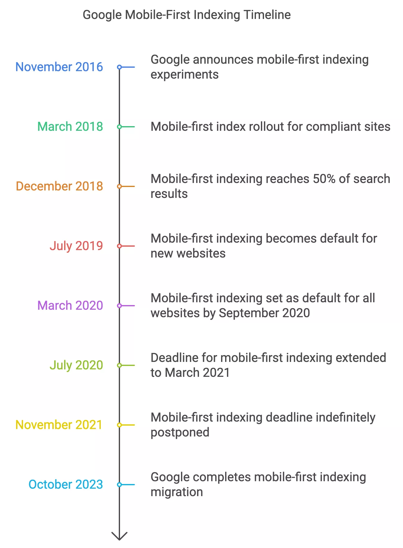
I’ve already mentioned the two critical milestones of Google’s mobile-first indexing: the mobile-friendly update of April 2015 and the announcement of the complete migration to mobile-first indexing as of July 2024. But to fully grasp the phenomenon known as “Google mobile-first”, let’s take a look at what happened between these dates:
This way, the migration to mobile-first indexing was not abrupt. Over the past nine years, Google has steadily prepared us for this moment. By gradually shifting the focus to mobile content, they ensured that websites could adapt and optimize for a predominantly mobile audience, aligning with the broader trend of increasing mobile internet usage.
Three Mobile-First Index Configurations
We have discussed the theoretical aspects of Google’s mobile-first indexing, but what does it look like in practice? In other words, how do you set up the mobile versions of websites? There are three main ways of setting up a mobile-friendly website, each with its advantages and disadvantages. Let’s explore these configurations in detail to determine which one you should choose, based on SEO requirements at the stage of website development or your existing setup.
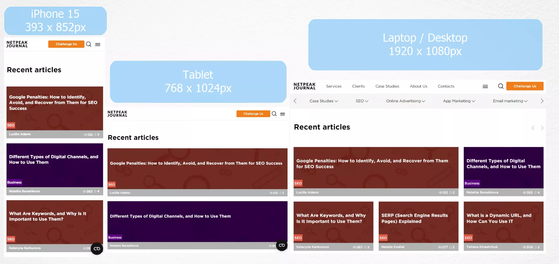
Responsive Design
Responsive design uses the same HTML code for all devices and adjusts the layout with CSS based on screen size. This allows the website to automatically fit any screen, offering an optimal viewing experience on any device:
Features:
- There is one URL for both mobile and desktop versions.
- Media queries are used to adapt the layout to different screen sizes.
Advantages:
- Maintenance is simpler because there’s only one version of the website.
- Users on different devices will have a consistent experience.
- There is no risk of duplicate content or related issues.
- SEO is simplified as all backlinks point to the same URL.
Disadvantages:
- Responsive design requires a thorough understanding of CSS and media queries.
- It can be complex to implement for intricate websites.
Dynamic Serving
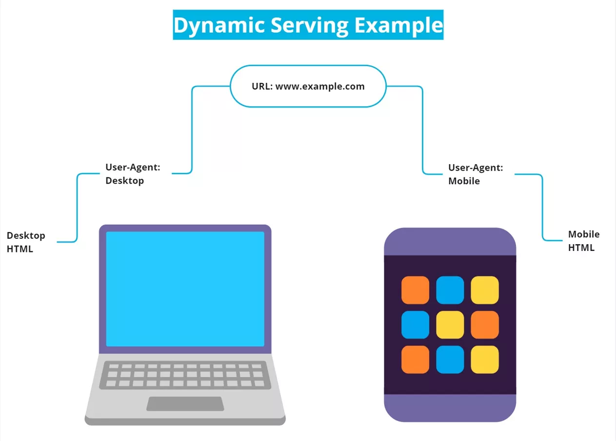
In dynamic serving, the server sends different HTML and CSS files tailored to the specific device in use. The URL remains the same, but the content served differs based on the user agent requesting the page:
Features:
- A single URL for both mobile and desktop versions.
- The server detects the device type and serves appropriate content.
Advantages:
- Dynamic serving provides device-specific content, optimizing the user experience.
- As one URL is maintained, duplicate content issues are avoided.
Disadvantages:
- It’s more complex to implement and maintain than responsive design.
- There is a risk of incorrect user agent detection, which could lead to inappropriate content delivery.
Separate URLs
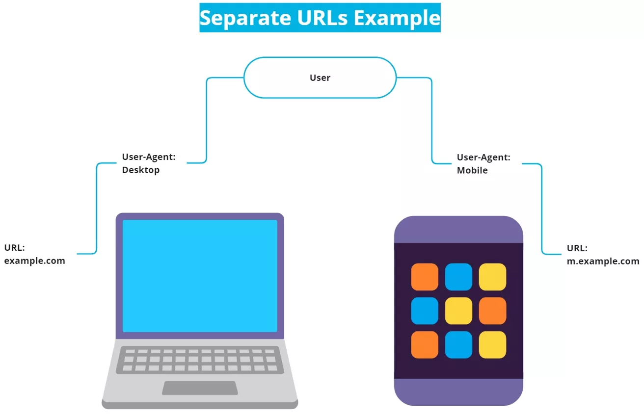
Configuring separate URLs involves having different URLs for mobile and desktop versions of a website. Typically, the mobile version is hosted on a subdomain (e.g., m.example.com):
Features:
- Mobile and desktop versions have different URLs.
- Mobile-specific content is served from a mobile subdomain or subdirectory.
Advantages:
- It allows for highly customized mobile experiences.
- It can also be easier to implement on older websites that cannot be easily adapted to responsive design.
Disadvantages:
- More maintenance is needed to manage two versions of the site.
- Duplicate content issues may occur if the canonical tags are not properly implemented.
- The risk of incorrect user agent detection is still something to keep in mind.
Ultimately, by choosing responsive design, you can avoid unwanted problems related to content and metadata mismatches between mobile and desktop versions of your site. It simplifies maintenance and ensures a seamless user experience across all devices, making it the preferred choice for many SEO specialists and web developers.
Taking this into account, responsive design can be considered the main mobile-first SEO recommendation. But is just having a responsive design enough to say that you are ready for mobile-first indexing on Google? Let’s take it further.
How to Do Mobile-First Indexing?
While having a responsive design is a great start, it’s not quite enough by itself. SEO is a set of complex actions that involves various aspects of a website, and optimization for Google mobile indexing is no exception. To ensure your site ranks well in the SERP, you must adhere to several best practices that I will explore next.
Guarantee Your Site’s Crawlability
It is crucial to ensure that the Googlebot Mobile can crawl your site. For instance, the pages you want to be indexed must not carry a noindex tag – a meta tag that tells search engines not to index a specific page.
Additionally, replace outdated technologies such as Flash with modern web technologies like CSS and JavaScript. Keeping your site up to date ensures that critical files will be accessible to Googlebot.
Remember, these files should not be blocked by a disallow rule in your robots.txt file, which shows search engine bots exactly how to “read” the site. Ensuring full accessibility allows the Googlebot to see your site as a user would and helps you achieve accurate Google mobile-first SEO.
Implement the Viewport Meta Tag
The viewport meta tag is vital for mobile indexing. It instructs browsers on how to control the page’s dimensions and scaling to fit different screen sizes, which is key for mobile devices.
Here’s an example of what the viewport meta tag looks like:
|
<meta name=“viewport” content=“width=device-width, initial-scale=1”> |
This tag should be included in the <head> section of your HTML. It instructs the browser to match the screen’s width in device-independent pixels and sets the initial zoom level to 1. This configuration enhances user experience by making the page readable and immediately usable on mobile without needing to zoom or scroll horizontally.
Enhance Media with Optimization
Images can be quite large and significantly increase the page size, which may slow down its loading time. To address this, try using the WebP format, which reduces image file sizes by 25-34% compared to JPEG or PNG while maintaining quality. Also, always use alt attributes for your images. These attributes help Google understand and process your images.
For videos, it’s important to implement VideoObject structured data. This data markup provides Google with explicit information about the video content, such as the description, duration, and thumbnail URL. It will increase the likelihood that your videos are processed correctly and appear in search results.
Utilize Structured Data Markup
Moving further into structured data, I strongly recommend reviewing all the types supported by Google and implementing those that are relevant to your pages. Structured data not only facilitates indexing but also enhances the visibility of content and increases the likelihood of it appearing as rich snippets in the SERPs.
Structured data aids search engines in grasping the page’s context, which is crucial for mobile users seeking fast and precise search results. Implementing schemas such as Product, Review, and Article can significantly enhance the presentation of your content in search results and potentially increase the click-through rate.
Prioritize Performance Optimization
When optimizing the page speed of your website, you should primarily focus on the mobile version, as its performance metrics are used for ranking. Not only that, mobile users also expect quick loading times, and slower pages can lead to a higher bounce rate.
This doesn’t mean that the desktop version should be neglected. However, having a website that performs well on the desktop but poorly on mobile would put you at a disadvantage in search rankings.
Overall, it’s clear that there are many aspects to consider when optimizing your site for Google mobile index. But let’s be honest, it may not be straightforward, and challenges may arise. Let’s discuss how to fix them in the next part of the article.
How to Fix Common Mobile-First Index Problems?
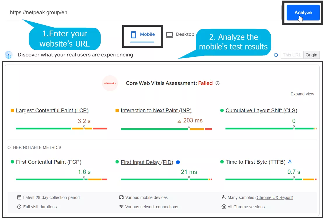
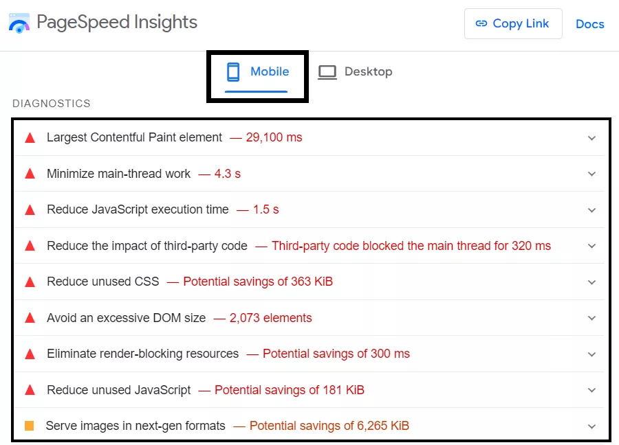
Through Google Search Console, you can easily check your site’s crawlability, and the viewport meta tag can be verified manually. However, fixing issues related to media optimization, structured data markup, and performance optimization often requires more specialized tools. I recommend using Google’s tools like PageSpeed Insights and Rich Results Test, as well as a comprehensive tool like Netpeak Spider for optimal results.
Analyze Your Site with Google’s PageSpeed Insights
Page speed is crucial for mobile users, and Google PageSpeed Insights provides a detailed analysis of your site’s performance on mobile devices. It also offers specific recommendations to improve load times and user experience.
Steps:
- Go to Google PageSpeed Insights.
- Enter your website URL and analyze the mobile version’s test results.
- Implement the suggested recommendations, such as compressing images and optimizing CSS and JavaScript.
Test Structured Data with Google’s Rich Results Test
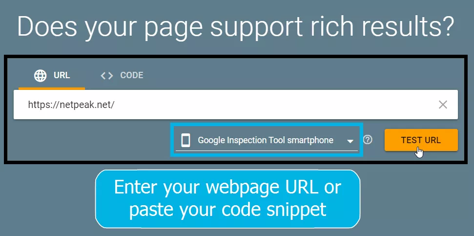
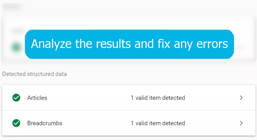
Google’s Rich Results Test tool verifies if your structured data markup is properly implemented and qualifies for rich results.
Steps:
- Visit Google’s Rich Results Test tool.
- Enter your webpage URL or paste your code snippet.
- Analyze the results, and fix any errors to ensure your structured data is correctly implemented.
Crawl Your Website with Netpeak Spider
Netpeak Spider is a comprehensive SEO tool that helps you audit your website for various technical issues. Begin by conducting a thorough crawl of your site to find issues like broken links, duplicate content, and missing metadata, as these can harm your site’s mobile performance.
Steps:
- Download and install Netpeak Spider.
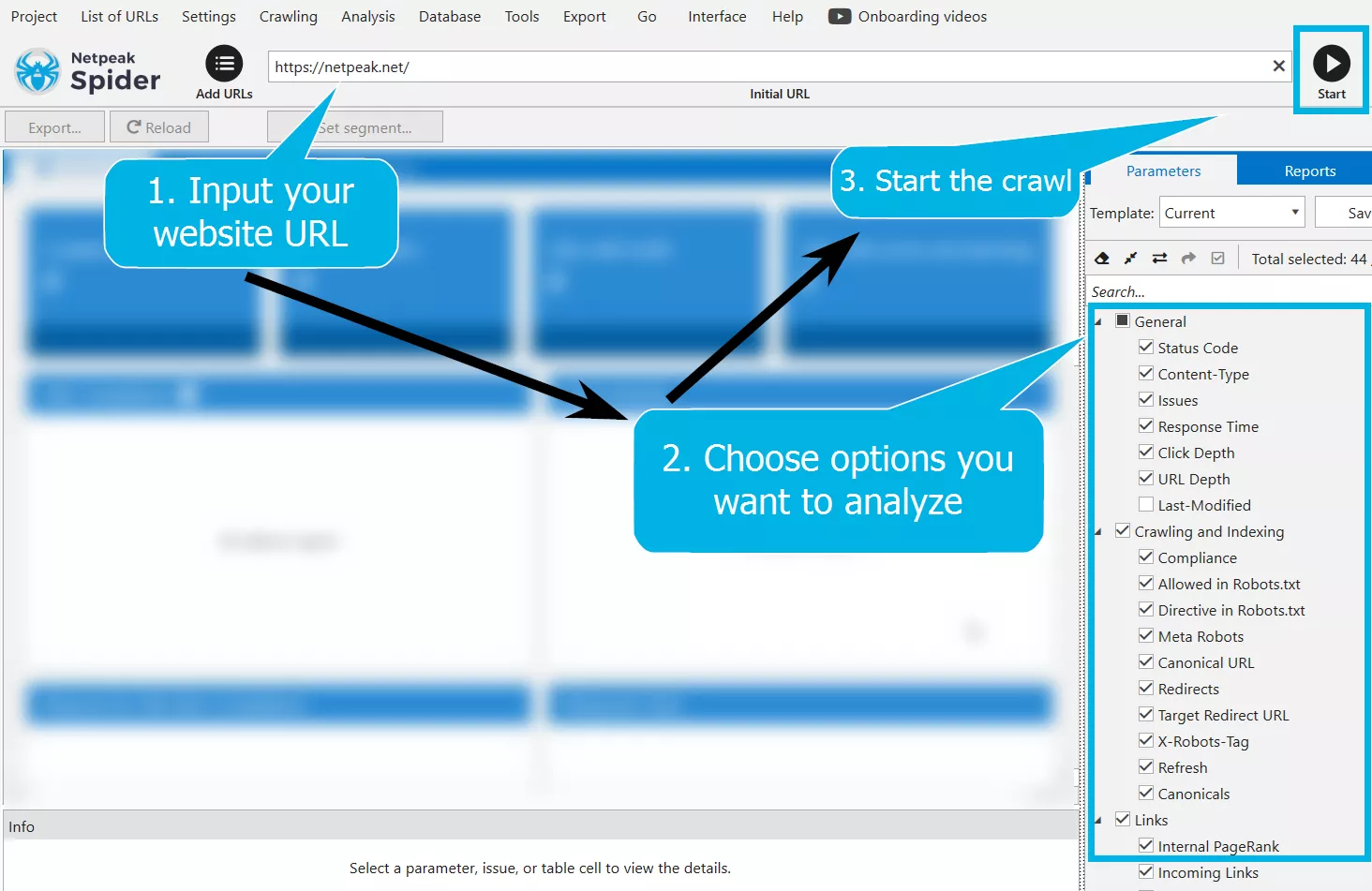
- Input your website URL and start the crawl with the options you want to analyze.
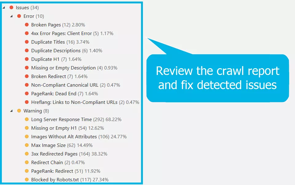
- Review the crawl report and fix detected issues such as broken redirects and missing alt attributes for images.
To ensure that the technical SEO audit of your site is done correctly and takes into account mobile-first indexing, consider reaching out to digital marketing professionals.
Netpeak Agencies Group, within the framework of a technical SEO audit, will provide recommendations and check that they are implemented correctly. Engaging experts can help you avoid common pitfalls and ensure that your site is at its best from an SEO mobile-first indexing perspective.
Conclusion
- Since over 60% of global internet traffic is from mobile devices, Google now mainly relies on the mobile versions of websites for indexing. This change, fully implemented by July 2024, emphasizes the importance of mobile-first indexing SEO.
To ensure your website is ready for mobile-first indexing, start by understanding the three main configurations:
- Responsive design.
- Dynamic serving.
- Separate URLs.
- Responsive design is often the preferred choice due to its simplicity and effectiveness in providing a seamless user experience across all devices. However, relying on responsive design alone is not enough.
- Comprehensive SEO practices, including ensuring crawlability, implementing the viewport meta tag, optimizing media, utilizing structured data, and prioritizing mobile performance optimization, are essential.
- Regular audits using tools like Google PageSpeed Insights and Netpeak Spider can help identify and fix common issues.
- If you find mobile-first indexing to be challenging, try consulting with SEO professionals, such as those from Netpeak Agency. We can provide valuable guidance and ensure your site meets all mobile-first index SEO requirements.
FAQ
What does mobile-first indexing mean?
Mobile-first indexing indicates that Google mainly relies on the mobile version of a website for indexing and ranking purposes. This approach prioritizes mobile content to provide the best experience for users accessing the internet on smartphones.
When was the mobile-first index rolled out?
Mobile-first indexing was first rolled out in March 2018 for sites following best practices. By July 2024, Google announced the completion of the migration to mobile-first indexing for all websites.
Which mobile-first indexing tool to use?
To optimize your website for mobile-first indexing, use Google’s PageSpeed Insights for performance analysis, Google’s Rich Results Test for structured data, and Netpeak Spider for comprehensive technical audits.
Is there a mobile-first indexing checklist?
Yes, there is. A mobile-first indexing checklist includes ensuring site crawlability, implementing the viewport meta tag, optimizing media, using structured data markup, and prioritizing mobile page speed optimization. Regularly check and fix issues using recommended tools.
What is the difference between mobile-first indexing and desktop-first indexing?
Mobile-first indexing gives priority to the mobile version of a website for indexing and ranking. Desktop-first indexing, used previously, focused on the desktop version of websites. The migration to mobile-first indexing reflects the increasing use of mobile devices and ensures better mobile performance and user experience.
Related Articles
Your Marketing Isn’t Working? Here’s How to Research Using DSA
How do you know if your expectations were too high or if your marketing team is failing? What exactly have you overlooked?
How to Promote a Recruitment Website in the US and Increase Traffic by 200% – The Huntly Case Study
How we helped a recruitment website attract its first employers in the highly competitive U.S. market
What Are .sig Files, and How Do You Use Them?
Email signatures are important both for personal email correspondence and for your brand. Let's figure out how to create them in this article

